Archive for the ‘Contests’ Category

contest 10: a humument, tom phillips

Friday, February 27th, 2015

[NOTE: The submission deadline has been extended to May 10, 2015.]

the book rules ok  -A Humument

vf10c

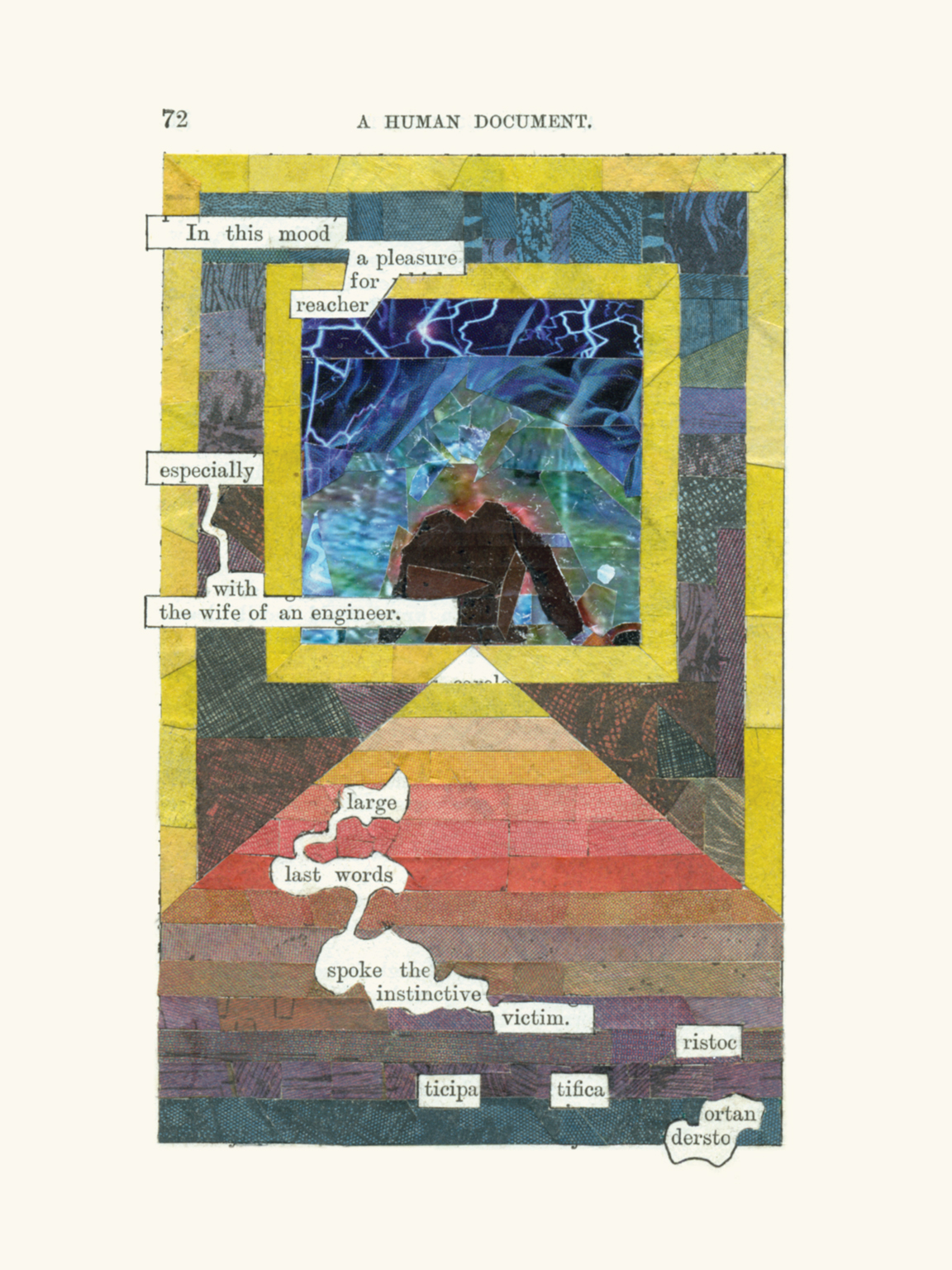
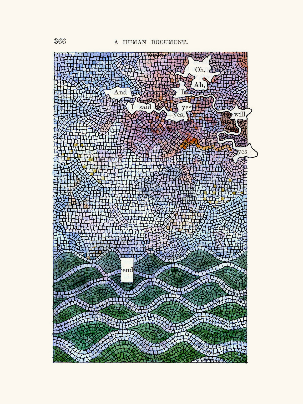
 A Humument by Tom Phillips is, in the words of Marvin Sackner, co-founder of the Ruth and Marvin Sackner Archive of Concrete and Visual Poetry a ‘visual-poetic artist’s book,’ a found novel whose every page has been altered by the artist through painting, collage, drawing, cut-up techniques, and even burning. The result is art, but it is also poetry (concrete, found, haptic), narrative, autobiography, oracle.  This ‘strange, beguiling work,’ as Adam Smyth calls it, is all of this and more owing to the erudition and humor of its immensely gifted and indefatigable creator.  And, importantly, it is also a work in progress. Since the artist has been at it now for nearly fifty years (Phillips first procured his source material, having decided to use the first book he could find for threepence, W. H. Mallock’s A Human Document in 1966) it is arguably in contention for being the work of longest duration by a living artist (or perhaps any artist living or dead).  Initially published in 1973, the latest version and fifth edition of A Humument was published in 2012. In it the work of revision continues with second versions of most of the pages. A Humument is also available in formats for iPad and iPhone, as well as a modified audiovisual version housed in a USB device. A perennial favorite, it has collected dozens of affirming articles over the years, some quizzical, some fawning, and some particularly intelligent and discerning such as Smyth’s  from the London Review of Books and William H. Gass’ from Artforum (My own admiration for Tom Phillips is no secret. I have previously written about him and interviewed him here.).

As Mallarmé said…

que tout, au monde, existe pour aboutir à un livre (that everything in the world exists to end up in a book)  -Le Livre, instrument spirituel

cover

Phillips clearly relishes the significant role that chance plays in this endeavor (to such an extent that he views A Humument somewhat as an oracular device), beginning with his more or less arbitrary selection of raw material. Had he chosen another volume that morning (or even another edition of the same work), the result would have been different and possibly even unsatisfying enough to compel him to abandon the project. Phillips admits that the project began ‘as idle play at the fringe of my work and preoccupations’ and that ‘virtually all the work on A Humument has been done in the evenings, so that I might not, had the thing become a folly, regret the waste of days’. But perhaps chance is simply part and parcel of the artists’ life.  In the end, he develops a strange and intimate relationship with Mallock and A Human Document, going so far as to suggest that the resulting work is ‘a curious unwitting collaboration between two ill-suited people seventy-five years apart.’

I asked Johanna Drucker , visual theorist and book artist and author of the seminal study The Century of Artists’ Books to discuss the significance of A Humument:

In some ways, A Humument is one of the most canonical and visible works in the field–perhaps the most visible. Phillips’s genius is in his graphics: the graphical imagination and inexhaustible invention of his intervention in the pages is fantastic. He plays with every trope of illustration and illusion, of textual reference and bibliographical construction, and he has a great sense of color and design. A Humument is absolutely his most compelling and public work, and for good reason. It is both a conceptual piece and a wonderfully executed work and will stand the test of time, I think, as an engaging and virtuosic exercise de style and demonstration of invention. Other artists have worked in the altered book format. Many have done more sculptural, spatial, or physical transformations. Many artists have cut, painted on, or otherwise made use of found books. So, in some ways, the elements of Phillips’s project–an excised text, altered book or pages, and painterly transformations– all connect to other strains of book art. This doesn’t take anything away from Phillips’s work, or its originality, but does situate it within a set of practices of which it is a part. 

I am truly delighted that Tom Phillips has agreed to bless our latest (and tenth!)  contest, which is to create an original visual and/or poetic work using any media or methods (You can view the entire book here! Or, better yet, why not purchase it.). He has also selected the page from A Human Document that will be the prima materia for this work. Of its particular significance, he says:

‘The first version of page 4 dates from the late sixties, with the usual minimal text for that period and the page otherwise covered with linear abstract penwork. When the time came to make the second version I was amazed to find ‘nine’ and ‘eleven’ in the appropriate order to echo that recent catastrophe. A Human Document has often turned up trumps in this way. Other words on the page will spur other people to quite different resulting pictorial and textual strategies.’

A high-resolution .tif of page 4 is here (Alternately, you can use the lower resolution .jpg here). The winner or winners selected by Tom Phillips himself will receive a limited edition Humument screenprint signed and editioned by the artist. Entries must be received by 10 May 2015 11:00PM GMT. See Humument Contest Brief for more information.

Many, many thanks to Tom Phillips and Lucy Shortis!

4-humtetrad-1152x1536A Humument, p. 4, first version (late 1960s)


4-humapp-1152x1536A Humument, p. 4, second version (2012)


AHDp4A Human Document, p.4


Selected pages from A Humument:

11-humapp-1152x1536


22-humapp-1152x1536


47-humapp-1152x1536


79


238-humapp-1152x1536-v.4


266-humapp-1152x1536


366-humapp-1152x1536

design contest 8: music for films, brian eno

Friday, June 29th, 2012


Brian Eno

“As an intellectually mobile loner, scene-setter, systems lover, obstinate rebel, techno-prophet, sensual philosopher, courteous progressive, close listener, gentle heretic, sound planner, adviser explorer, pedant and slick conceptual salesman, and devoted fan of the new, undrab and surprising, wherever it fell between John Cage and Little Richard, or Duchamp and doo wop, or Mondrian and Moog, Eno busily and bossily remodeled pop music during the 70s. He looked at what the Velvet Underground, Can, Steve Reich and the Who had done, went forth and multiplied. Eno created an atmosphere, and helped determine what the history of electronic music was between the avant garde 1950s and the pop 21st century.” – Paul Morley

If it’s not clear from the laundry list in the quote above, the absurdly-prolific ‘non-musician’ Brian Eno has done enough over the past forty years to variously impress, interest, annoy or alienate just about everyone. There are, of course, his early art school inflected Kraut-, glam, and prog-rock beginnings and his later work with ‘ambient’ and ‘generative’ music; his long list of now-legendary collaborative efforts and producing credits (among a certain subset of rock cognoscenti Eno is the eternal brilliance behindand everything good aboutRoxy Music, David Bowie, and Talking Heads); and, finally, his disparate extracurricular activities: Oblique Strategies, Obscure Records, 77 Million Paintings, The Long NowA Year With Swollen Appendices not to mention his ubiquity as an interviewee and lecturer on art, music, science and technology. Eradicate most of the last 25 years, and step back into the mid-70s, and the man and his oeuvre become at least somewhat manageable (no best-selling Irish rock bands, no Windows 95 start-up sound, no Spore). This was arguably Eno’s most fertile period: in just those few years he generated (or helped generate) such a startlingly wide range of music with a ridiculous number of brilliant collaborators (in particular Robert Fripp who, in my opinion, was an indispensable component of Eno’s sound and process during their long and fruitful association) on so many different records that it would surprise no one if one or two albums should fall through the cracks.  From that era Music for Films, in particular,seems to be perennially overlooked.

Music for Films

“This album is a compilation of fragments of my recorded work over the last two or three years. Some of it was made specifically for use as soundtrack material, some of it was made for other reasons but found its way into films; most of it is previously unissued in any form.”  -from the back cover of Music for Films

“It is not Eno’s fault – although it’s not been to his disadvantage either – that the ‘soundtrack to an imaginary film’ concept is now so commonplace that it no longer stands up as a concept, it’s just a thing, a clump of words, no more meaningful than ‘rock’ or ‘punk’.  – Frances Morgan

“The real films in [Music for] Films are the ones on the backs of your eyelids or behind your forehead, much as they must have been when Eno was first creating them.”Serdar Yegulalp

“This and much else of Eno’s music has its own psychological landscape in our shared consciousness. By design it is not the bumper-ridden library music typical of a broadcasting industry interested in moving participants by cuing advertisements. Music in film can foment empathy which can be difficult to restrain when you know the music a director has chosen, a sense of sharing a secret in total silence as you stare at the screen steeping in your own past. Where might Eno’s music prove effective as just such a means, of passively compelling trust, honesty and assent? Who would tend to trust the message of a film with an Eno soundtrack? Clever bastards like us.” – Tim McGowan

1978 saw the ‘official’ release of Brian Eno’s Music for Films, a collection of 18 short and musically disparate instrumental tracks, a handful of which had previously surfaced on a 1976 promotional LP of the same name (which consisted of 25 musical interludes, including some unreleased and others that appeared elsewhere, notably 1975’s Another Green World). Not officially part of Eno’s Ambient Series nor, in fact, strictly ‘music for films’ they range in tone and mood from impressionistic sketches of an ‘ambient’ nature to darker, quirkier and, in some cases, louder pieces that could just a easily be at home on Before and After Science or Another Green World or might be found on one of the Dieter Moebius/Hans-Joachim Roedelius collaborations (or even the slightly later My Life in the Bush of Ghosts with David Byrne). Perhaps never considered to be among Eno’s very best work of any period or genre (overshadowed at one end by the more conceptually ambitious Ambient 1: Music for Airports with its four long glacially-paced looping tracks, and at the other by the controlled mania and kitchen sink maximal-ism of his earlier ‘rock’ albums), nevertheless, Music for Films remains a consistently interesting and quietly surprising album.

The Cover

Brian Eno’s album covers have always tended toward the interesting, (one or two I find exceptional, notably Music for Airports), and he was fortunate to count work by the brilliant artists Tom Phillips and Russell Mills among them. On some level, however, the covers have always seemed more intent on establishing Eno’s artistic, intellectual, and theoretical bona fides (and, especially with the earlier albums, his overall weirdness) than anything else. The cover for Music for Films, however, is radically different.  Not so much designed as intentionally left blank, the chocolate brown Helvetica text is pushed to the extreme upper edges of the texture-less and indescribably beige cover (the same text layout was used to good effect for the Cluster collaborations After the Heat and Begegnungen). This apotheosis of neutrality avoided the plain brown wrapper look in favor of what in retrospect seems closer to the generic packaging popular in grocery stores in the late ‘70s (or perhaps a reference color from Interiors, Woody Allen’s beige-est Bergman-esque film, also from 1978). Importantly, the cover is not ‘conceptual’ in the way that Richard Hamilton’s design for The Beatles’ ‘White Album” is, nor has it the cool rigor and studied minimalism of any number of ECM or Factory Records covers that – brilliant as they are (and they are brilliant) – somehow appear positively baroque in comparison. Rather, music and cover co-exist nicely as a unit, the latter providing no commentary on the former (or anything else for that matter), simply existing as a visual analogue to the wordless music. It’s a nice conceit.

The Contest

So in spite of the fact that Music for Films perhaps already has the perfect cover, and because we prefer difficult projects and are very fond of the album and believe it deserves new listeners (and re-listeners), we are sponsoring a competition for a new LP cover. You can find all of the rules and gobbledygook here (read them, please), but keep in mind that the deadline for submissions is 1 September 2012 and that there will be a $500 US prize for the entry that jurors like best as well as some special Eno-related prizes to be announced. All of the tracks can easily be found on any number of video-sharing and music-streaming sites ( Note: There were two different track orders. The later EG version with the revised sequence is now the standard so, unless you have a 1978 Polydor or Antilles LP, this is the sequence you will most likely hear.). If you have any questions you may e-mail us at: admin {at} venusfebriculosa {dot} com
The Jury

Were honored to have as jurors:
Geeta Dayal, staff writer specializing in culture reporting at wired.com;  electronic music journalist; columnist at Frieze Magazine; contributor to The New Grove Dictionary of Music; author of Another Green World; commentator, Brian Eno, 1971–1977: The Man who Fell to Earth.

Frith Kerr, director of the graphic design consultancy Studio Frith based in London, frequent collaborator with artists and architects, including Juergen Teller, Michael Clark, Tate Modern, Valentino, Victoria and Albert Museum; member of Alliance Graphique Internationale.

Brad Laner, founder of the beautiful/noisy/guitar-y/drone-y band Medicine (of particular note is their 1992 debut Shot Forth Self Living) and the experimental electronic project Electric Company; musical genius in and behind many other  bands; contributor to Brian Eno’s Another Day on Earth.

Russell Mills, artist;  illustrator and co-creator of More Dark than Shark; book and album cover designer (most famously Nine Inch Nails’ The Downward Spiral as well as the Eno collaborations Apollo: Atmospheres and Soundtracks and The Pearl); sound installation artist; recording artist (Pearl + Umbra).

Rick Poynor, writer/essayist focusing on design and the visual arts; cultural critic; design historian; founder of Eye magazine; co-founder of Design Observer; contributing editor of Print magazine; author, with collaborators Brian Eno and Russell Mills, of More Dark than Shark.

Alice Twemlow is a British-born writer and educator based in New York. She is chair and co-founder of the Design Criticism MFA program at the School of Visual Arts in New York City and also a PhD candidate in Design History at the Royal College of Art in London. Alice is a contributor to Design Observer and writes about design for publications including Eye and Architect’s Newspaper. She is the author of What is Graphic Design For? (Rotovision) and of numerous essays.


UPDATE: We hope to have the results of the contest posted by Monday, October 8. We apologize for the delay!

patrycja bialoszewska & neco gil, winners, book cover design contest #5

Monday, March 14th, 2011

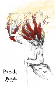
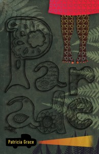
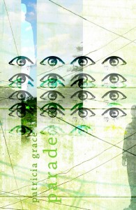
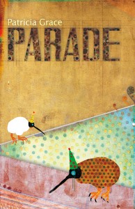
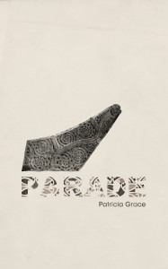
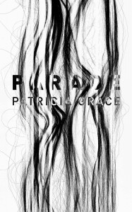
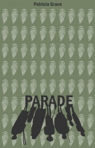
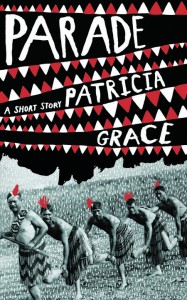
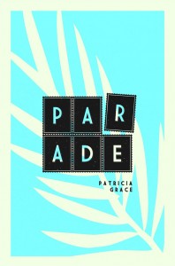
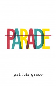
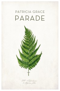
We’re pleased to announce the winner of Book Cover Design Contest #5 [Parade by Patricia Grace]. The winning prize will be shared by Patrycja Bialoszewska of Wroclaw, Poland  and  Neco Gil of London, England.  Of Bialoszewska’s cover, Patricia Grace says ““The woman is caught and almost framed, and yet rejects and turns away from the frame. She questions her identity, one face of her turned away, uncertain. But she comes to a realisation, becomes erect in pride and dignity.”

Many thanks to our jurors Patricia Grace, John Gall, and Marco Sonzogni.

There were many excellent covers among the 84 entries. Below are just a handful:


From top:

First row (l) Agata Jakubowska, (r) Tsvetelina Panova.

Second row (l) Andrey Bashkin, (r) Jay Paavonpera.

Third row (l) Anne Jordan, (r) Rusudan Margishvili.

Fourth row (l) Elliot Stokes, (r) Ash  Hutchinson.

Fifth row (l) Jonathan Yue, (r) Kristina Moersdorf.

Check back here in the next day or two for  a link to all of the entries.

Thanks to all who participated!

book cover design contest #5: parade, patricia grace

Friday, December 3rd, 2010

2010-12-03_110012“Yesterday I went with Hoani, Lena, and the little ones up along the creek where the bush begins, to cut fern and flax.


So begins “PARADE“, by Māori author Patricia Grace (1937 –  ) from her short story collection Waiariki published in 1975, the first such collection by a Māori woman writer.

A brief summary from the New Zealand Book Council website:

“Patricia Grace is a major New Zealand novelist, short story writer and children’s writer, of Ngati Toa, Ngati Raukawa and Te Ati Awa descent, and is affiliated with Ngati Porou by marriage. Grace began writing early, while teaching and raising her family of seven children, and has since won many national and international awards, including the Kiriyama Pacific Rim Book Prize for fiction, the Deutz Medal for Fiction, and the Neustadt International Prize for Literature, widely considered the most prestigious literary prize after the Nobel. A deeply subtle, moving and subversive writer, in 2007 Grace received a Distinguished Companion of the New Zealand Order of Merit for her services to literature.”

The prize for the winning entry is $1500NZ!

Jurors include the author herself,  illustrious book cover designer John Gall, Venus febriculosa colleague Marco Sonzogni, and the former publishing director of Penguin NZ, Geoff Walker.

As usual, complete information and rules are here.

You may read the full text of the story is here.

Anna Zyśko

Sunday, October 3rd, 2010

Anna ZyskoAfter the grueling efforts on the part of our five distinguished jurors to determine a winner with initially no consensus among them (luckily, I was not one of them!), we are relieved and very pleased to finally congratulate the winner of our Book Cover Contest No.4, Anna Zyśko of Tarnobrzeg, Poland, for her wonderful cover. Truly, this was an almost impossibly difficult contest and we are grateful to every one of the 241 entrants from 44 countires who courageously took part in the endeavor and who submitted many interesting and well-designed covers. Below are are six covers that we like (click on each for larger image). You can view all of the entries here. Again, thank you all, and stay tuned for No.5!

gary_gowanspeter_chmeladamian_ langoszRazvan_Mitoiuagata_jakubowskaneven_udovicic

Top Row, Left to Right: Gary Gowans, Fife, Scotland; Peter Chmela, Blatná na Ostrove, Slovakia.

Middle Row, Left to Right: Damian Langosz, Krośnica, Poland; Razvan Mitoiu, Ploiesti, Romania.

Bottom Row, Left to Right: Agata Jakubowska, Lodz, Poland; Neven Udovičić, Zminj, Croatia.

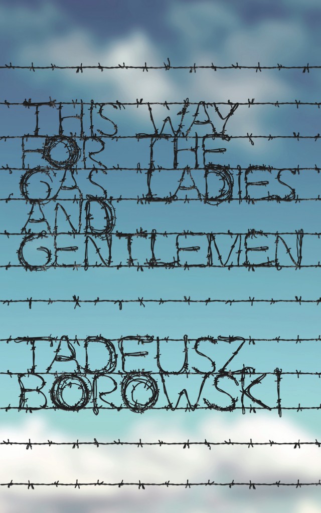
Anna studied under Professor Piotr Lech and received her Diploma in Graphic Design in 2009 from the Art Institute of Maria Curie-Skłodowska University in Lublin. When contacted, she had the following to say about her cover:

As I am from Poland I have been to Auschwitz and currently living in Lublin I have also seen Majdanek. Books by Tadeusz Różewicz and Zofia Nałkowska were required reading when I was a teenager. Seeing and reading about it was a memorable, shocking experience which I used when designing the cover.

Camp barbed wires are compounded in the title and author’s name, but the background shows blue sky – in order to underline that the book not only describes in detail the everyday life of prisoners who were killed but also shows that a few of them survived.

suzene ang, winner, book cover design contest #3

Monday, May 31st, 2010

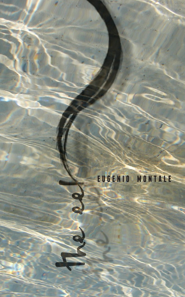
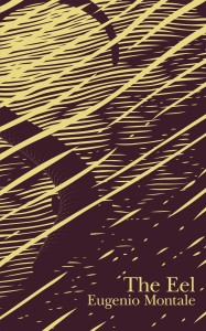
We are pleased to announce the winner of Book Cover Design Contest #3 [The Eel by Eugenio Montale]. Congratulations to Suzene Ang of Singapore for her lovely, lyrical cover.

suzeneang

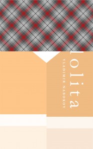
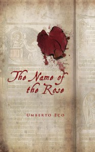
Suzene has participated in all three contests so far, producing the wonderful and clever design for Lolita which was a favorite of Vintage Books creative director John Gall. Suzene’s entry for The Name of the Rose was also a strong contender.

suzene1

Suzene Ang


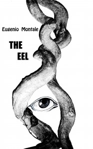
Two other covers we like for this contest were from Ryan Igarashi and Marija Despotovic, both of whom have participated in past contests as well.

 ryan_igarashiMarija Despotovic 1


We hope everyone continues to participate!

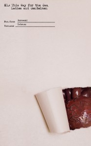
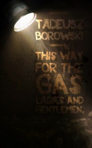
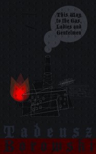
book cover design contest #4: this way for the gas ladies and gentleman, tadeusz borowski

Wednesday, May 26th, 2010

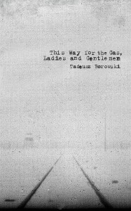
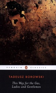
this way for the gasI am excited about our latest contest. I was recently introduced to the work of Polish writer, journalist, and poet  Tadeusz Borowski (1922-1951) through his brilliant and unsettling short story collection This Way for the Gas, Ladies and Gentlemen (originally published in Poland as Pożegnanie z Marią) based on Borowski’s experiences from 1943-1945 as a prisoner in Auschwitz and Dachau and later in a camp for displaced persons (upon which, incidentally, Andrzej Wajda‘s fantastic 1970 film Landscape After Battle is based. Wajda, of course, is the Polish filmmaker best known for his superb works Ashes and Diamonds (1958) and the recent Katyn (2007).). When first published, Borowski’s unfliching, almost clinical, accounts resulted in accusations of decadence and nihilism, but now his unadorned prose appears truly courageous in its clarity and honesty. We are pleased to have as our patron the Consulate General of the Republic of Poland in Los Angeles.

We told them with much relish about our patient, concentration camp existence which has taught us that the whole world really is like the concentration camp; the weak work for the strong, and if they have no strength or will to work – then let them steal, or let them die.

 The world is ruled by neither justice nor morality; crime is not punished nor virtue rewarded, one is forgotten as quickly as the other. The world is ruled by power and power is obtained with money. To work is senseless because money cannot be obtained through work but through exploitation of others. And if we cannot exploit as much as we wish, at least let us work as little as we can. Moral duty? We believe in neither the morality of man, nor in the morality of systems. In German cities the stores are filled with books and religious objects, but the smoke from the crematoria still hovers above the forests…

Won’t you participate? Rules here (polski tekst).

the name of the rose winner!

Thursday, April 29th, 2010

After what seems like ages, we are thrilled to announce the winner of The Name of the Rose Book Cover Contest. Turnout was remarkable, and we most sincerely thank all of those who participated and whose designs made this contest such a pleasure! In all there were 254 entries from 50 countries. Poland topped the list with 35 submissions followed by the US with 30 and the UK with 25. You can see the breakdown here.

 The fact that the overall quality of the covers was so high made judging extremely difficult to say the least, and so we must again stress that there is a degree of arbitrariness inherent in selecting a single winner from among so many excellent submissions. The diversity was extraordinary, and it was wonderful to see such a wealth of ideas expressed so brilliantly. If it were possible, we would have awarded a half-dozen or more first prizes. As it was, it was an excruciating process wherein we first selected our top fifty choices, which we then painstakingly narrowed down to fifteen, then five, and finally, to one.

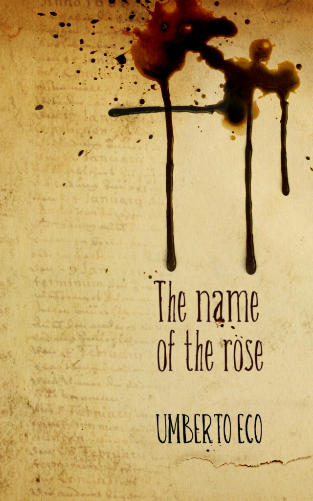
Razvan MitoiuSo without further ado, we’d like to congratulate our winner, Razvan Mitoiu of Ploiesti, Romania for his stunningly evocative cover! Communicating an almost overpowering dark primitivism, it succeeds because it is suggestive of so many things: ritual, mystery, violence. The dark dripping fluid (blood, poison, ink, wax?) is a wonderful Rorschach image: is it an occult, pagan, or alchemical symbol; the beginning letters of an interrupted word; a crucifix; or a purely accidental spill with no meaning whatsoever? The torn page, the faded text with the English words January and February clearly visible and repeated, the text that appears to be written by hand but on closer inspection is not; all of these little mysteries compound the sense of general unease. In short, we loved it and feel that it well represents the themes present in Eco’s remarkable novel.

We will be highlighting some of our favorites over the next few day, but in the meantime you can see all of the entries here.

book cover design contest #3, l’anguilla (the eel), eugenio montale

Monday, March 1st, 2010

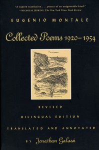
montale galassiFor our third contest we embraced having as our subject a play or a poem and considered, among others, T.S. Eliot’s The Wasteland and Seamus Heaney’s forthcoming collection Human Chain . Fortuitously, I was recently introduced to the work of Italian poet Eugenio Montale, winner of the 1975 Nobel Prize for Literature and a contemporary of  T.S. Eliot. Montale, who died in 1981,  published hundreds of poems, but we have chosen one of a mere thirty lines, the acclaimed L’anguilla, from his 1956 collection La bufera e altro. We prefer Jonathan Galassi’s sublime translation, whose volume of Montale’s collected poems was awarded the Premio Montale and the 1999 Oxford-Weidenfeld Translation Prize:


The Eel


The eel, siren

of cold seas, who leaves

the Baltic for our seas,

our estuaries, rivers, rising

deep beneath the downstream flood

from branch to branch, from twig to smaller twig,

ever more inward,

bent on the heart of rock,

infiltrating muddy

rills until one day

light glancing off the chestnuts

fires her flash

in stagnant pools,

in the ravines cascading down

the Apennine escarpments to Romagna;

eel, torch, whiplash,

arrow of Love on earth,

whom only our gullies

or dessicated Pyrenean brooks lead back

to Edens of generation;

green spirit seeking life

where only drought and desolation sting;

spark that says that everything begins

when everything seems charcoal,

buried stump;

brief rainbow, iris,

twin to the one your lashes frame

and you set shining virginal among

the sons of men, sunk in your mire—

can you fail to see her as a sister?


Contest rules may be found here: THE EEL BOOK COVER CONTEST

A copy of the poem in Italian along with Galassi’s English translation may be found here: The Eel

There is a wonderful link to Montale’s acceptance speech along with other documents related to his winning of the 1975 Nobel Prize for Literature here.


book cover design contest #2: the name of the rose

Monday, December 14th, 2009

Eco_Il_nome_della_rosa 1We’re starting a new book cover contest.

After deliberations that included among others Joyce’s Ulysses, Beckett’s Waiting for Godot, Kafka’s The Metamorphosis, Eliot’s The Wasteland, Bataille’s The Story of the Eye and of course Nabokov’s The Original of Laura, we chose semiotician Umberto Eco’s 1980 postmodern novel The Name of the Rose. Hopefully this will prove rich soil for some wonderful and interesting covers. We received 155 submissions for our Lolita cover contest and we’re hoping to double that number so help get the word out. This time there will be only one submission per entrant.

The prize will be $1000 US.

The deadline is Friday, February 26, 2010.

You can find all of the rules here.