Archive for the ‘Uncategorized’ Category

bollingen: an adventure in collecting the past, william mcguire

Friday, March 9th, 2012

What was perhaps the most extraordinary publishing venture of the last century was inaugurated in 1943 by Mary Conover Mellon, the 39 year old wife of philanthropist Paul Mellon (who, along with his sister and two cousins for a period comprised half of the eight richest people in the country).

The catalyst for this illustrious enterprise was a five-part seminar conducted by psychiatrist C. G. Jung that the Mellons attended in New York in 1937. What began then as an already ambitious project by Mary to publish the collected works of Jung in English translation exploded into a remarkable publishing program of hundreds of titles that included works by Joseph Campbell (The Hero with a Thousand Faces), Mircea Eliade (The Myth of the Eternal Return), Heinrich Zimmer (The King and the Corpse), Marie-Louise von Franz (Aurora Consurgens), and Jaroslav Pelikan (Imago Dei: The Byzantine Apologia for Icons) to name a few, as well as critical translations of new and classic works: the collected works of Paul Valery, Pushkin’s Eugene Onegin translated by Vladimir Nabokov and The I Ching translated by Richard Wilhelm. The Bollingen Foundation (named for the village where  Jung built his retreat the “Tower”)  sponsored archaeological expeditions, established research fellowships, initiated a poetry prize and a lecture series and in general supported the work and livelihood of a startling number of people including Olga Fröbe-Kapteyn, who organized the annual Jung-related Eranos lectures at her home in Anscona, Switzerland and Natacha Rambova, the silent film costume and set designer (and wife of Rudolph Valentino) turned Egyptologist. The story of the Bollingen Foundation is full of fascinating tales and eccentric people, behind which is glimpsed only rarely the elusive figure of the philanthropist with a nearly limitless bank account whose major gifts to institutions include the Yale Center for British Art, and the East Wing of the National Gallery of Art.

My introduction to the Bollingen Series came in 1984 during my freshman year at St. John’s College when I purchased a copy of The Collected Dialogues of Plato that absolutely radiated gravitas through its austere olive green jacket. Those first year students flush with cash were also able to buy another Bollingen book, the newly published Oxford Translation of Aristotle with its brilliant shiny cover somewhere between French ultramarine and cobalt blue (I remember it costing an exorbitant $60).  The rest of us had to make do with Random House’s rather tweedy old Basic Works of Aristotle. (To be sure, though, the famous series at the St. John’s bookstore was unequivocally the fusty diminutive volumes of The Loeb Classical Library, specifically the Greek texts bound in green linen with gold embossing and Irish green jackets — two years of Greek was required, but no Latin. I still have the two Loebs:  Sophocles’ Oedipus Tyrranus and Sextus  Empiricus’ Outlines of Pyrrhonism).  My junior year I acquired my third and last program-related Bollingen: Charles S. Singleton’s translation of Dante’s Commedia.
davis carr

Friday, December 30th, 2011

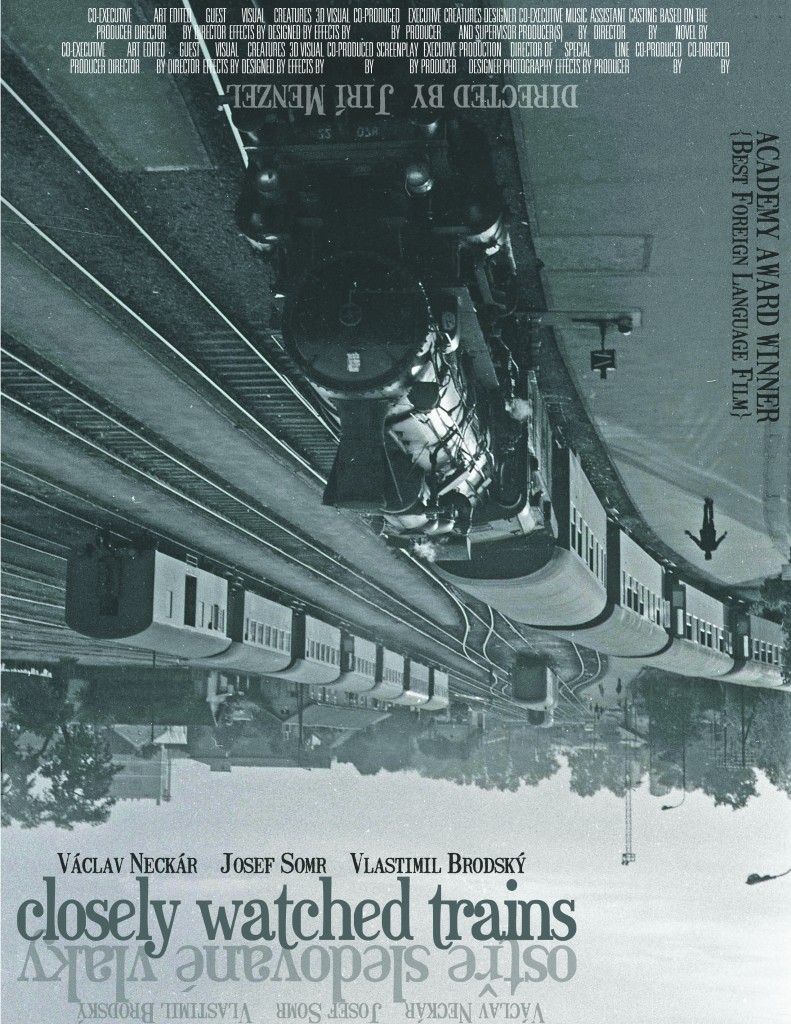
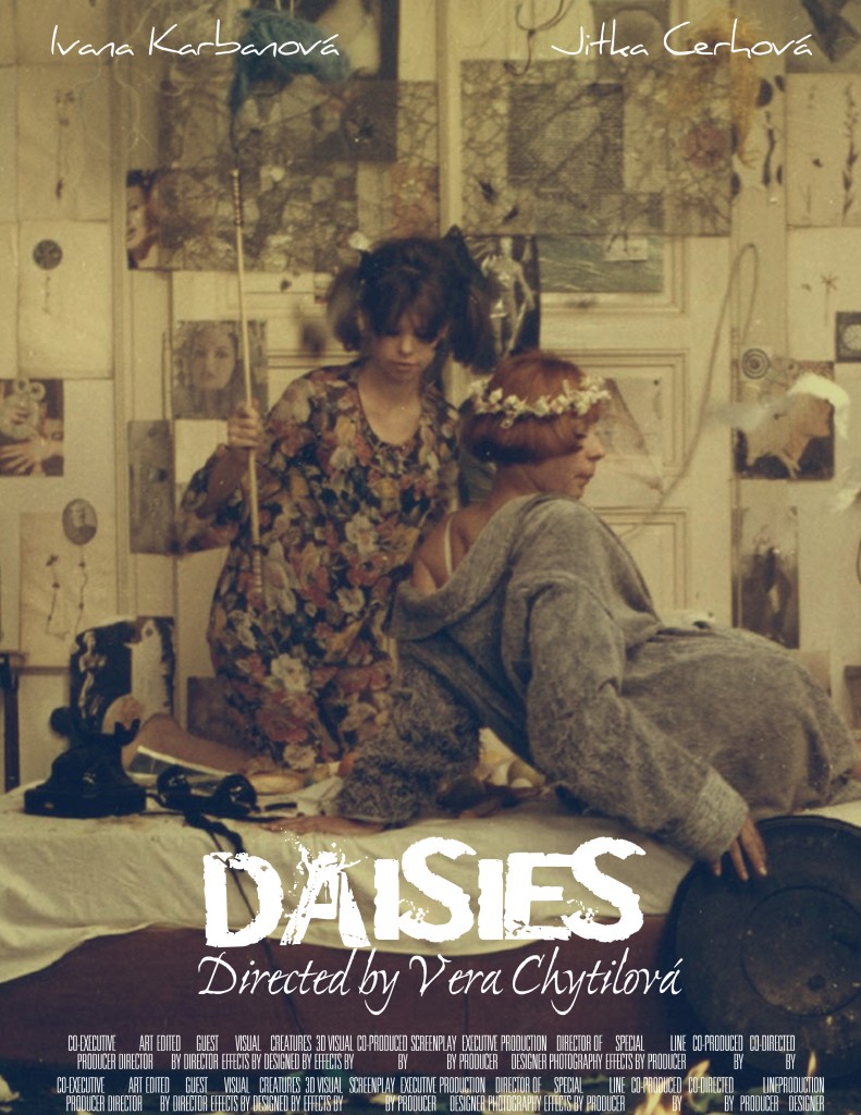
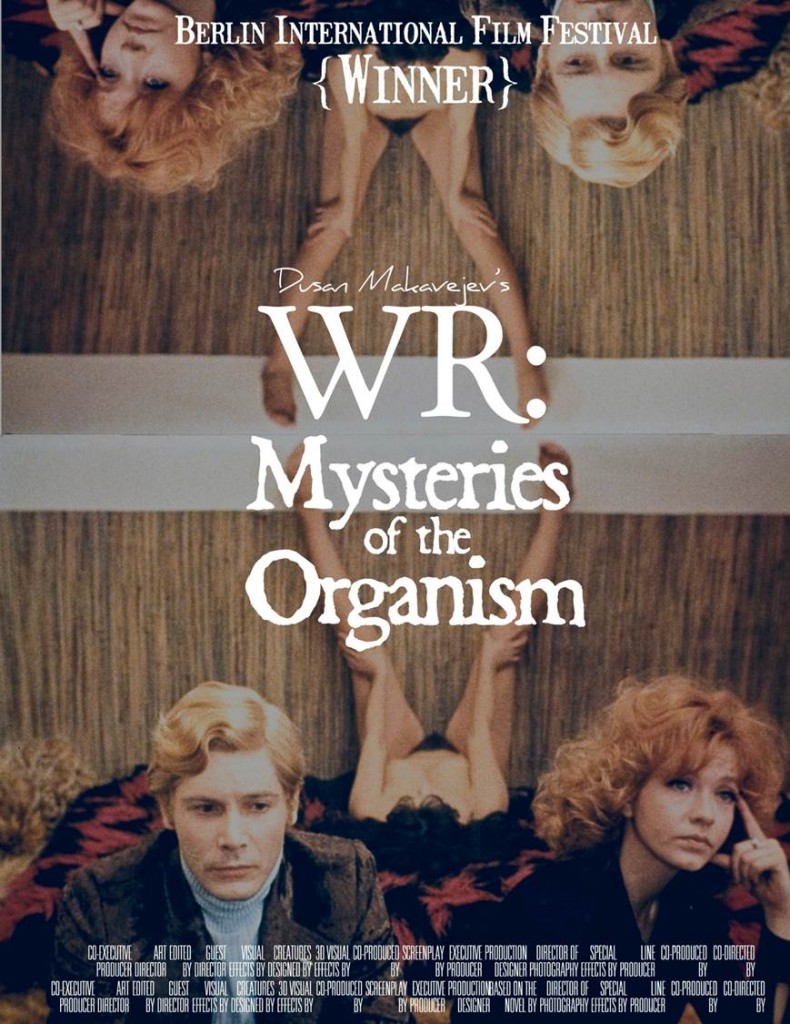
My colleague Yuri Leving recently taught a course entitled EAST EUROPEAN CINEMA: WAR, LOVE, AND REVOLUTIONS. Among the many wonderful (and seminal) films viewed and analyzed were Jiri Menzel’s Closely Watched Trains (Czechoslovakia, 1966), Dusan Makavejev’s WR: Mysteries of the Organism (Yugoslavia, 1971), Vera Chytilova’s Daisies (Czechoslovakia, 1967), and Elmar Klos’ and Jan Kadar’s The Shop on Main Street (Czechoslovakia, 1966). One student, Davis Carr, created poster designs for several of the films featured in the syllabus. Yuri was eager to share these with me and I, in turn, am delighted to share them here. I think they compare favorably to current Criterion and Second Run offerings.

You can read Carr’s commentary on these posters here and view the complete PowerPoint presentation that includes several additional posters.

keenan!

Tuesday, August 2nd, 2011

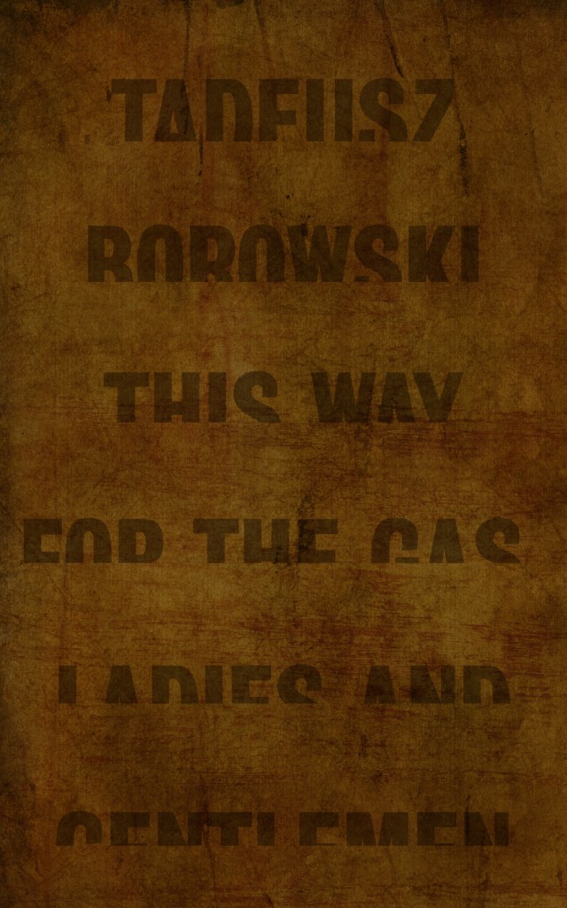
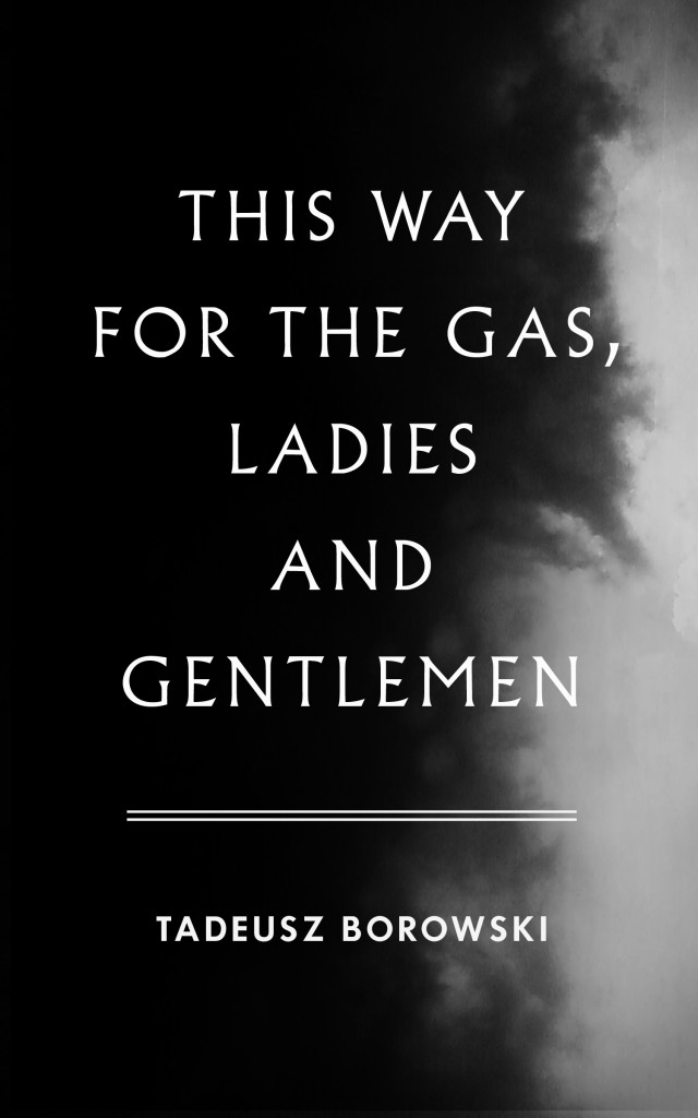
Hard to beat Jamie Keenan‘s cover for This Way for the Gas, Ladies and Gentlemen.

From my essay:

“Several nearly monochromatic covers reveal unexpected eloquence by using obscured, distorted and disappearing text to great effect. Jamie Keenan’s truncated words that appear to be in the process of sinking into a heavily textured background suggest the methodical erasure of countless lives that vanished into nothingness.”

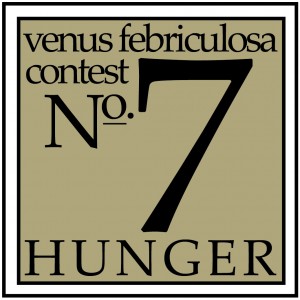
suzene ang, winner contest no. 7

Sunday, July 31st, 2011

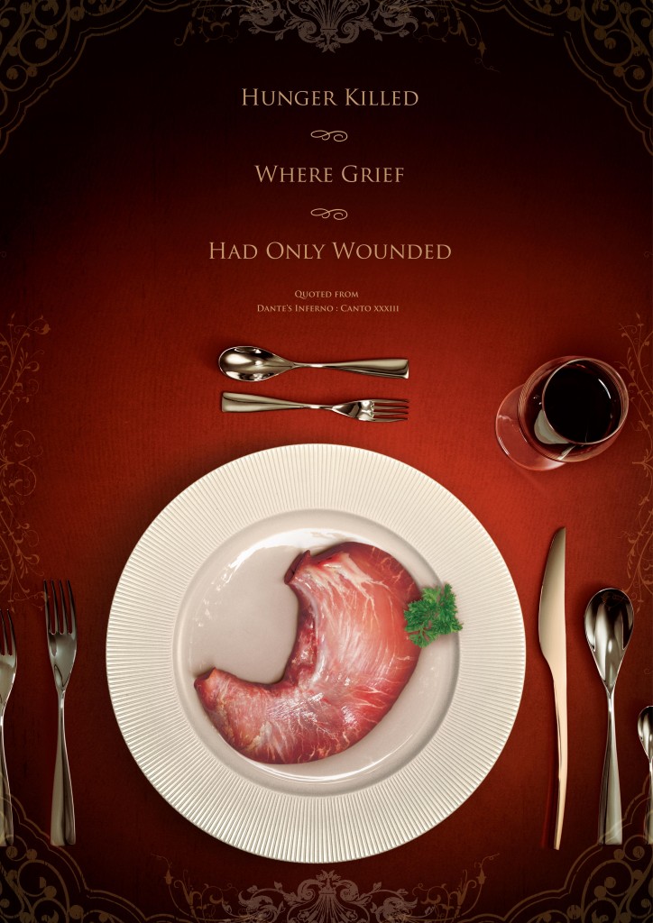
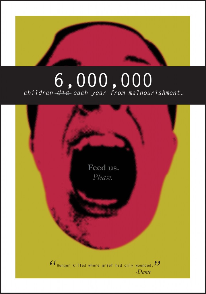
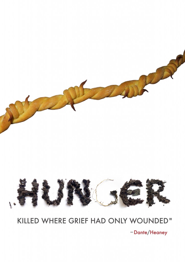
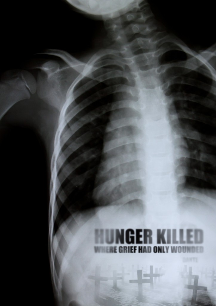
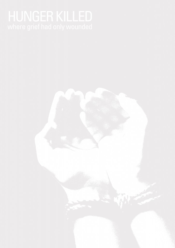
It was a rather dissapointing turnout for the latest contest, both in terms of number of submissions (58) and overall quality. It was perhaps too difficult a task to integrate the Dante/Heaney quote with all of its ambiguity and complexity with the notion of a global hunger campaign. In many ways, the two notions were at odds. Marco and I discussed not awarding a prize at all. Still, there were several bright spots and we were in agreement on the five best entries, none of which were excellent, but which still seemed measurably better than the rest. Moreover, we agreed that Suzene Ang’s entry was just that much better than the other four. We were also aware that since Suzene was the winner of a previous contest as well as being honorably mentioned in others that perhaps there would be a sense of impropriety or unfairness in our decision. We decided, though, that no one should be penalized for submitting high-quality entries to several contests and, in the end, we decided to award Suzene one-half of the prize money and to donate the remaining half to Save the Children, not because she has been a past winner, but because we felt that no one submitted an entry that succeeded on all counts.

With that being said, we are pleased to also show the four runners-up. From top to bottom shown below are Jessie Kroeger, Eva Toth, Mitoui Razvan and Ryan Igarashi.

david gee

Wednesday, July 20th, 2011

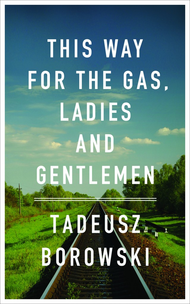
I love David Gee‘s cover for This Way for the Gas, Ladies and Gentlemen.

From my essay:

“In one cover, Peter Chmela uses the device of a documentary-like image, a ‘realistic’ grainy and overexposed black and white photograph, its authority further reinforced by the use of a font modelled on jumpy mid-20th century typewriter text. The typical response to such indicators is automatic: it is seen as objective, matter of fact, historical; in other words, a cover befitting the gravity of the subject, a methodology commonly used when the imprimatur of verity is needed or sought (take for example, the use of black and white photography in Steven Spielberg’s 1993 film Schindler’s List, a half century after the advent of Technicolor’s three-strip process).

David Gee on the other hand, quite consciously used no such indicators, explaining that the idea for his cover

came after noticing that there is a common visual language for books of this nature: black and white imagery, black letter text, grungy effects; all employed to do most of the work for the reader. I used a colour photograph to contemporize the cover and emphasize that these events did not occur in black and white. They happened on beautiful days as often as they did on overcast, grey, gloomy days, and this only serves to deepen the horror.


Gee also took pains to clarify his use of the particularly legible font:

The type itself is set in DIN which was adopted by the German government in the late 1930s.[i] It was borne of a need and desire for ‘standardization and simplification’ (conveniently, Germans could read the new pan-European road and rail signs from their tanks) but the fact that these two words had greater and parallel ideological implications makes it all the more chilling.

Upon request Gee agreed to share his initial idea whose sombre black and white cover and funereal font support his argument above. Beautiful, stately and perhaps appropriate in any other context, the austere design is elegiac, verging on the heroic, and vaguely fascistic. Gee obviously realized it was quite wrong for this ‘anti-redemptory’ collection of stories and instead chose the direction above.”


[i] The German standards organization Deutsches Institut für Normung adopted the font, known as DIN 1451 in 1936.

contest no. 7, hunger

Tuesday, May 3rd, 2011

“The malnourished winter queues were eerily silent”

I’ve been reading Lidiya Ginzburg’s Blockade Diary (written during the 900-day Siege of Leningrad during the Second World War) on the heels of Tim Snyder’s excellent book Bloodlands: Europe Between Hitler and Stalin (where in addition to the Siege he discusses Stalin’s horrific 1932-33 famine-genocide in the Ukraine that killed, at a minimum, three million people and quite possibly many millions more) and filmmaker Sergei Loznitsa’s remarkable 52-minute Blokada (consisting entirely of silent black and white film footage found in Soviet archives to which Loznitsa meticulously added sound, creating an eerily immediate and ultimately devastating document about the death by starvation of approximately one million Leningraders between September 1941 and January 1944).

“hunger killed where grief had only wounded” Inferno, Canto XXXIII/75

In 1289, five men starved to death in a tower in Pisa./In 1981 ten men starved to death in the H-Blocks in Northern Ireland.

The above quote, from Dante, is a translation by Irish poet and Nobel Laureate Seamus Heaney (1939 – ) that appears in his poem “Ugolino” from his 1979 collection Field Work. My colleague and friend Marco Sonzogni, himself a translator of Heaney, recently brought it to my attention. “Ugolino” is his translation of lines 1-90 of Canto XXXIII of Dante’s Inferno (Here is an interesting essay on the Heaney translation) which tells the story of 13th century Italian nobleman Ugolino della Gherardesca who, along with his sons and grandsons, was imprisoned in a tower by Ruggieri degli Ubaldini, the Archbishop of Pisa and left to starve.  Heaney possibly chose this portion of the Inferno to translate because the specter of hunger still looms large in Ireland, where in the 19th century the Great Famine killed a million people and sent another million scattering to other countries.  Heaney himself has said he considered dedicating “Ugolino” to the hundreds of Irish Republican prisoners who, starting in 1976, when their Special Category Status as political prisoners was revoked, refused to wearing prison uniforms and instead chose to wear only blankets, and later refused to bathe after being assaulted on their way to the baths by prison guards. The “Blanket Protest” and the “Dirty Protest” was ultimately followed by the hunger strikes in which Bobby Sands and nine others died.

Today, according to the United Nations World Food Programme, hunger is by far the most significant health risk worldwide. One in six people, or 925 million suffer from not getting enough to eat day after day, and every year six million children in developing countries die from malnourishment. The myriad causes are often inextricably linked: war, poverty, political unrest and disenfranchisement, corruption, economic underdevelopment, famine, environmental overexploitation

Marco had the wonderful idea to use the Dante/Heaney text in a poster contest to highlight awareness of world hunger. We are reaching out to a number of organizations and will work with one of them to make this contest part of its campaign against hunger. Our goal is to create a book of images and essays much like the This Way Project, the proceeds of which will go directly to that organization to alleviate hunger worldwide. Can a poster overcome complacence? Can it spur a distracted world to action? I recall the moment in 1999 when I read Peter Singer’s The Singer Solution to World Poverty in the New York Times Magazine and in fact its unassailable logic did spur me to action and it has affected me ever since. I’ve been in touch with Singer recently and, while he has no interest in judging a poster contest, he has agreed to advise us in our endeavor.

So here is the contest: To design a poster promoting awareness of world hunger that will spur us all to action!

Size: A2 420mm x594mm (approximately 16.5” x 23.5”)

Orientation: Vertical (Portrait) Only

Required Text: “hunger killed where grief had only wounded”

Deadline: 1 July 2011

Prize: 1200 USD

Jury: To be announced.

Here are the complete Hunger Contest Rules

Organizations:

Save the Children

OXFAM

United Nations World Food Programme

Welthungerhilfe

*   *   *

Ugolino

We had already left him. I walked the ice
And saw two soldered in a frozen hole
On top of other, one
’s skull capping the other’s,
Gnawing at him where the neck and head
Are grafted to the sweet fruit of the brain,
Like a famine victim at a loaf of bread.
So the berserk Tydeus gnashed and fed
Upon the severed head of Menalippus
As if it were some spattered carnal melon.
“You,” I shouted, you on top, what hate
Makes you so ravenous and insatiable?
What keeps you so monstrously at rut?
Is there any story I can tell
For you, in the world above, against him?…

(the reply)
…As I watched through a narrow hole
Moon after moon, bright and somnambulant,
Pass overhead, until that night I dreamt
The bad dream and my future’s veil was rent…

…They were awake now, it was near the time
For food to be brought in as usual,
Each one of them disturbed after his dream,
When I heard the door being nailed and hammered…

…Saying, “Father, it will greatly ease our pain
If you eat us instead, and you who dressed us
In this sad flesh undress us here again.

So then I calmed myself to keep them calm.
We hushed. That day and the next stole past us
And earth seemed hardened against me and them.
For four days we let the silence gather.
Then, throwing himself flat in front of me,
Gaddo said,
“Why don’t you help me, Father?
He died like that, and surely as you see
Me here, one by one I saw my three
Drop dead during the fifth day and the sixth day
Until I saw no more. Searching, blinded,
For two days I groped over them and called them.
Then hunger killed where grief had only wounded.

When he had said all this, his eyes rolled
And his teeth, like a dog’s teeth clamping round a bone
Bit into the skull and again took hold.

wioletta lenczowska, winner, cover design contest no. 6

Sunday, May 1st, 2011

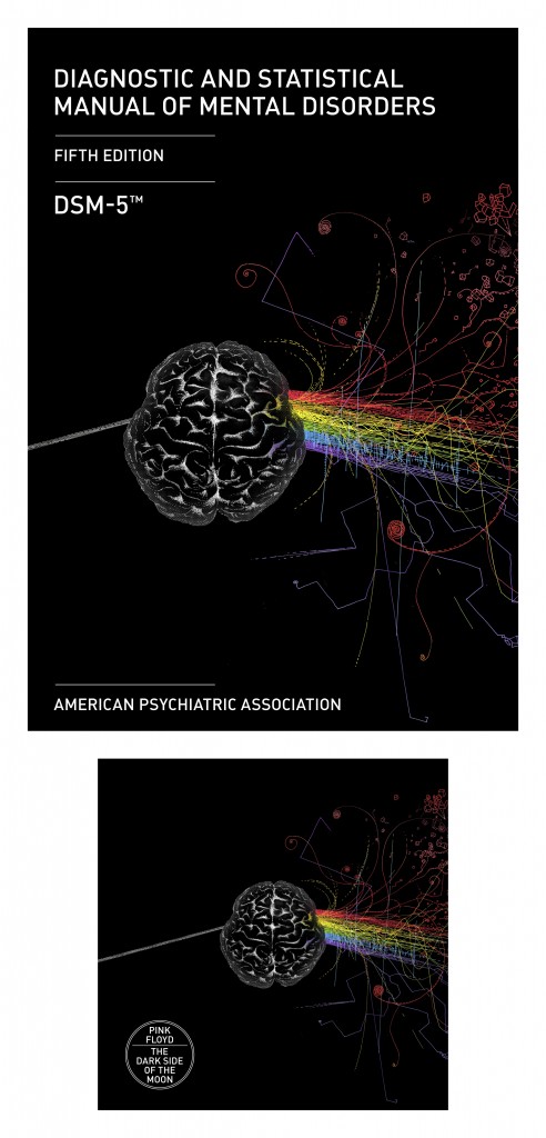
Perhaps our cover design contest no.6: DSM-5/DSoM at 40, american psychiatric association/pink floyd [2013] was a bit, shall we say, open ended. In any event, there was a record low turnout (fewer than 40 entries!).  Still, if the thirty-odd designs hewed rather closely to relatively predictable images (prisms, rainbows, brains) there were nonetheless among them some well-executed and interesting covers. I especially liked the shattered prism of Moira Perez (Spain) and the light-absorbing prism of Tomasz Florczak (Poland).  Gary Gowans (UK) and Narayana Navarroza (Philippines) both opted for a new, top-down perspective, while the cover of Fionn Byrne (Canada) emphasizes the particular dimensions of diagnostics. Janusz Marciniak (Poland) found inspiration in a rainbow aura. Helena Raczynska-Pachut (Poland) and Przemyslaw Pachut (Poland) rounded out the sequence with their interpretations.  Lastly, I should note that a few people, at least, dispensed with expected themes altogether. I liked the rather clinical covers of  Mia Vucic (Croatia).

Still, it was Wioletta Lenczowska (Poland) whose precise and lovely covers seemed just right.

Row 1:

Moira Perez

Row 2:

Tomasz Florczak

Row 3:

Gary Gowans (l)

Narayana Navarroza (r)

Row 4:

Fionn Byrne (l)

Janusz Marciniak (r)

Row 5:

Helena Raczynska-Pachut (l)

Przemyslaw Pachut (r)

Row 6:

Mia Vucic

this way: covering/uncovering tadeusz borowski’s this way for the gas, ladies and gentlemen

Wednesday, April 13th, 2011

Hitler was a megalomaniacal artist intent on remaking the world, not only through murder on an unprecedented scale, but by destroying the ethical relationship between words and truth and images and reality. The Holocaust and Holocaust Denial were twins born in the same monstrous womb. In the twenty-first century, can we possibly recapture the Renaissance ideal that “the eye is the window of the soul”? How can we reconnect words and images to deconstruct Orwellian lies, numbing kitsch and totalitarian faux-art? Using Tadeusz Borowski’s This Way for the Gas, Ladies and Gentlemen as a proof text,  Venus febriculosa has challenged some of today’s finest artists to reconceptualize the book cover as a way to reconnect words and images as a pathway to a human but horrifying truth. This Way for the Gas provides an interesting trigger for analysis and discussion on what might not be a new quest, but a challenge radically changed in the post-Holocaust era.

-Liebe Geft, Director, Simon Wiesenthal Center Museum of Tolerance, 2011

In Auschwitz, the concentration camp that was Hitler’s factory of death, the murdering of several thousand people each day had to be extremely well organized. The Germans chose young men from among the prisoners for various office chores, especially couriers.   Their lives were prolonged for the moment, but they never knew for how long.

Tadeusz Borowski was one of them, and that unusual state of being suspended between life and death he described in stories right after the war, expressing incredulity that “man could conjure up such a fate for man.”

No one who survived Auschwitz dared to write:

“Between two throw-ins in a football game nine thousand people had been gassed.”

For that honesty and truthfulness he paid with his life.  Caught in the web of propaganda and put in the position of having to write lies about the communist future of Poland, he preferred to commit suicide.

-Andrzej Wajda, 2011

Venus febriculosa is thrilled to announce its first book! Edited by Marco Sonzogni and with contributions from Alicia Nitecki, Berel Lang, Simone Gigliotti, John Bertram (that’s me!), Dov Bing, Monica Tempian, and Giacomo Lichtner This Way is began with our Book Cover Contest #4. For more information visit This Way Project.

You can see some sample pages from the book here.

Available now from Dunmore Publishing, Ltd. Order here!

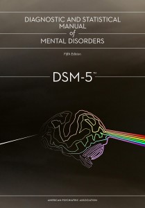
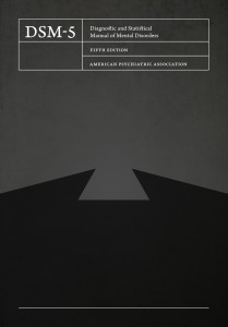
cover design contest no.6: DSM-5/DSoM at 40, american psychiatric association/pink floyd [2013]

Friday, February 4th, 2011

Here is something new and different.

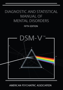
Publication of the fifth edition of Diagnostic and Statistical Manual of Mental Disorders (DSM-5) in 2013 will mark one the most anticipated events in the mental health field, replacing the current edition, DSM-IV-TR. DSM is the standard classification of mental disorders used by mental health professionals in the United States and contains a listing of diagnostic criteria for every psychiatric disorder recognized by the US healthcare system.
2013 also marks the 40th anniversary of the release of one of the best-selling albums of all time: The Dark Side of the Moon by English progressive rock group Pink Floyd. DSoM is also one of the most recognizable album covers ever, designed by
Hipgnosis partners Storm Thorgerson and Aubrey Powell and created by associate George Hardie. Thorgerson also designed the cover for the 20th Anniversary box set edition, and also participated in the design of the 30th Anniversary 5.1 channel surround sound mix on the SACD format.

The purpose of the contest is to explore the interrelationship between these two very different works. 

Submissions may be in the form of a book cover or CD/DVD for the DSM-5 and/or an album cover or CD/DVD for the 40th Anniversary of the Dark Side of the Moon or a “mashup” of both works.

 Entries are dues Friday, April 1, 2011.

There will be at least one prize of $671 US for the winning entry. There may also be several interesting non-cash prizes for entries worthy of special mention.

Complete information and rules here.


Image by Storm Thorgerson

#5 deadline extended until February 15th

Tuesday, January 11th, 2011