david gee
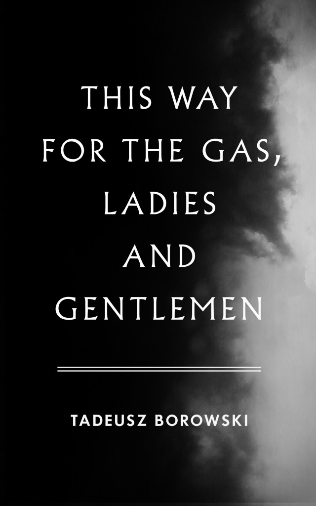
I love David Gee‘s cover for This Way for the Gas, Ladies and Gentlemen.
From my essay:
“In one cover, Peter Chmela uses the device of a documentary-like image, a ‘realistic’ grainy and overexposed black and white photograph, its authority further reinforced by the use of a font modelled on jumpy mid-20th century typewriter text. The typical response to such indicators is automatic: it is seen as objective, matter of fact, historical; in other words, a cover befitting the gravity of the subject, a methodology commonly used when the imprimatur of verity is needed or sought (take for example, the use of black and white photography in Steven Spielberg’s 1993 film Schindler’s List, a half century after the advent of Technicolor’s three-strip process).
David Gee on the other hand, quite consciously used no such indicators, explaining that the idea for his cover
came after noticing that there is a common visual language for books of this nature: black and white imagery, black letter text, grungy effects; all employed to do most of the work for the reader. I used a colour photograph to contemporize the cover and emphasize that these events did not occur in black and white. They happened on beautiful days as often as they did on overcast, grey, gloomy days, and this only serves to deepen the horror.
Gee also took pains to clarify his use of the particularly legible font:
The type itself is set in DIN which was adopted by the German government in the late 1930s.[i] It was borne of a need and desire for ‘standardization and simplification’ (conveniently, Germans could read the new pan-European road and rail signs from their tanks) but the fact that these two words had greater and parallel ideological implications makes it all the more chilling.
Upon request Gee agreed to share his initial idea whose sombre black and white cover and funereal font support his argument above. Beautiful, stately and perhaps appropriate in any other context, the austere design is elegiac, verging on the heroic, and vaguely fascistic. Gee obviously realized it was quite wrong for this ‘anti-redemptory’ collection of stories and instead chose the direction above.”
[i] The German standards organization Deutsches Institut für Normung adopted the font, known as DIN 1451 in 1936.


