second skin, john hawkes

October 13th, 2009

second skin


I’ve always admired the austere covers of New Directions books.  Often little more than a single black and white photograph and a bit of black text against a white background, they appeared rudimentary in design but were nearly always engaging. Of the many designers over the years I know of perhaps a half dozen: Alvin Lustig, who was responsible for the early color covers; Andy Warhol; Gertude Huston, the art director at New Directions who was married to founder and publisher James Laughlin; Stefan Salter, Roloff Beny, Rudolph de Harak.

One of my favorites also happens to be one of my favorite books. Second Skin by John Hawkes is a harrowing, hallucinatory read, and as often as I read it I am never confident that I’ve really grasped what transpires. The cover, of a similar quality, was designed by Jean Krulis and Gertude Awe, about whom I’ve unearthed little information beyond the fact that they designed a number of covers for New Directions, including Adventures in the Skin Trade by Dylan Thomas. Krulis, it appears, graduated from Cooper Union in 1957. Aside from that, the internet is silent. Somewhere I am sure there is a marvellous resource that lists all of the New Directions designers and their covers.

lyuba haleva

October 12th, 2009

samples2Lyuba Haleva, the winner of the Lolita Cover Contest graduated with a degree in Book & Graphic Design from the National Academy of Art in Sofia, Bulgaria and now works as a freelance graphic designer in Sofia (I’ve included a sample of her work).

I asked her to speak a bit about her entry and she eloquently responded:

“Vladimir Nabokov’s Lolita is masterpiece of human frailty and inspiration. In my design I attempted to convey the duality of Humbert’s image of perfection. The reality and idealization of his obsession form a pair of wings which take the imagination to soaring heights and abysmal lows. Desire, intellect, sexuality and innocence mix to create an intoxicating cocktail. Love, even in its unorthodox form has the power to elevate and enlighten us.”

Thank you for that, Lyuba! And again, congratulations.

lolita cover contest results!

October 7th, 2009

The Lolita Cover Contest has ended and I want to express my heartfelt thanks to everyone who took the plunge and participated. Your efforts made it so intriguing! In all, 105 entrants from 34 countries submitted a total of 155 entries (multiple entries being allowed). After the US and the UK, Poland and India had the most submissions with five each.

This was an extremely difficult exercise. There were interesting submissions on many different levels and it was quite wonderful to simultaneously review them all. In retrospect, however, I would not have limited the contest to one winner. I realized perhaps too late the inevitable arbitrary nature of this exercise and, forced to choose between conceptually different entries of equal merit, I developed my own rules in order to decide between them. My personal bias leans towards simple, elegant, graphically strong designs and typeface is important but remember that I am not a graphic designer.

In judging the submissions I tended to avoid lingerie, lollipops, roses, hearts, lipstick prints, butterflies, heart shaped sunglasses, and overtly sexual poses (as well as the unexpected recurring themes of swings and Rorschach blots) which by now have been indelibly linked to the cultural concept “Lolita” if not the novel itself. It’s important to keep in mind that the novel may be considered a love story, but it’s not Lolita who is in love.  And, of course, well beyond that one can explore the brutality and humor of the novel, the beauty of the prose and the cleverness of the wordplay. This is a tall order for a book cover, and of necessity draconian choices must be made.

I was able to narrow my selection to fifteen or so covers, from which I chose four that were conceptually quite different but all excellent.  Keep in mind that any of these could have been first place covers.

The first prize goes to Lyuba Haleva of Bulgaria for her wonderfully lyrical submission.

Winner Lyuba Haleva

Although arguably anachronistic in its imagery and typeface, the use of Lolita (and Annabel?) as Humbert’s wings perfectly communicate the novel’s poetry and Humbert’s high-minded yet deluded pursuit of fantasy and art.  Since I felt this was a crucial component of the novel it ultimately edged out others that leaned towards a darker reading.

As runners up I chose covers by  Aleksander Bak of Poland, Derek McCalla of the United States, and Egor Krasnoperov of Russia (click on each cover for a larger image).

Aleksander BakThis reductive exercise by Aleksander Bak is sad, lurid, even funny. The lone unmoored pink scrunchy manages to be a potent symbol: surrounded by black, it’s s a memento mori representing Humbert’s loss of Lolita and the tragedy of the novel in general. Inevitably, of course, it’s also a stand in for an orifice (you decide whose and which one). The tension between the base and the sublime is wonderful and the composition is wonderful.

Derek McCalla

Derek McCalla’s image is shocking, almost radical. I see it as a witness to Humbert’s destruction of Lolita’s childhood through narcissistic acts of manipulation. In many ways it’s a grim book (let’s not forget that practically everyone dies). Interestingly, Chris Pritchett, McCalla’s instructor at Virginia Tech used this contest as an exercise for his screenprinting class which is offered through the university’s architecture department and populated by first-year though fifth-year architecture students. I asked Pritchett why he had chosen to use this as an assignment:

“I felt this was a good project for architecture students because as a graphic exercise they are forced to convey a wide range of emotion through one image.”
Egor Krasnoperov 1

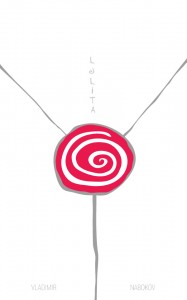
Egor Krasnoperov cleverly and humorously gives us a triple-entendre, at least the way I see this. First of course, there is the lollipop theme, present in all its banality, but rendered here beautifully and naively; then the circle that censors Lolita’s crotch, and, finally, the hypnotic vortex into which Humbert has fallen and which, quite literally, centers on Lolita’s sexuality. Pretty wonderful for such a minimal image.

Suzene Ang1

John Gall, vice president and art director at Vintage/Anchor Books and designer of the latest cover of Lolita (see samples of his work here), kindly agreed to review the submissions and picked his own top choices. His favorite is by Suzene Ang of Singapore:

“It takes a second before you see what is going on. It’s abstract enough to keep it metaphorical, yet literal enough to imply a sense of story. I love the tease of having the type run up the leg. Elegant, with a sense of humor.”

He also liked the Aleksander Bak cover that was one of my top choices:

“For second place I like the simplicity of the hair scrunchy design. Nice double entendre. I worry though, that it might be too much of a contemporary reference.”

Gall made a point a few times of stressing the difficulty of the task:

“This is a tough assignment. So many clichéd images to either avoid or make new. Not an easy task.  I teach a cover design class and wouldn’t give this as an assignment in a million years!”
Lucie Lebaz 3

I also asked Barbara Bloom to weigh in, an artist whose Nabokov-themed work has involved the use of existing Lolita book covers in addition to designing her own, not only for Lolita, but also much of the Nabokov ouevre :

“As a matter of principle, I rejected all of the: (sucking) lollypop remakes, lurid images of young girls, underwear, heart shaped anythings. I have chosen a few covers not so much for their style of rendering, or excellence in typographic or design strategies. These are covers that seem to have a more complex and psychological reading of the text.”

She selected as her favorite an entry by Lucie Lebaz of the UK (in fact she liked three by Lebaz):

“Like that they form ONE body together. And LOVE the pink triangle.”
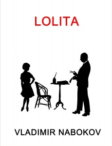
LOLITA cover.Bloom

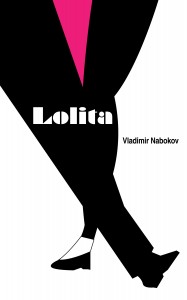
Above is Bloom’s own cover. Susan Tallman, in her essay in the artist’s monograph, writes:

“Most remarkable, however, is the absurdly apropos silhouette BB found for the cover of Lolita: the pompous (and paunchy) Nabokovian male at the lectern, the saucy stance of the little girl (the word ‘minx’ seems almost unavoidable) who thrusts her hip at his tendentious fingers. One does wonder what other purpose the image could ever have served.”

Addendum: Bloom also listed Aleksander Bak’s scrunchy cover among her favorites. Since we all liked his fantastic cover he will be awarded a special prize.

You can find all of the entries here: Lolita Submissions

And a list of all entrants including state and country: Entrants List

Now, shall we make this an annual contest? Let me know…

lolita cover contest deadline tonight

October 2nd, 2009

The contest will end at 11:59pm Friday October 2.

ron rosenbaum on the original of laura

September 25th, 2009

http://www.slate.com/id/2229224/pagenum/all

dj lolita

September 17th, 2009

dupartThis is getting pretty far afield, but I just love this cover. Not that house music has anything to do with this blog.

rodion shchedrin

September 14th, 2009

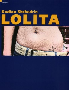
shchedrin coverHere’s something a little different: the score of the piano reduction of Rodion Shchedrin’s opera Lolita.  A contemporary Lolita is pictured on the cover, complete with lizard tatoo, navel piercing and cargo belt.

barbara bloom

September 13th, 2009

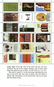
Lolita Stamps.BloomContinuing our Lolita book cover theme I am grateful to Barbara Bloom for providing this image of her 1998 work Lolita Stamps (you can find her design among them) as well as this quote by Susan Tallman from the retrospective catalogue The Collections of Barbara Bloom:

“BB was drawn to the relentless precision of Nabokov’s prose, and also to the manner in which that relentlessness resulted, not in difficult avant-gardism, but in flat out beauty. (The terrifying thing about Lolita is that it is simultaneously so repugnant and so beautiful.) Like the obsessive lover who seeks to re-dress the object of his desire in the clothes he wants to see her in, BB set about designing her own covers for most (not all) of Nabokov’s novels, quite often by gracing them with prior work of her own: Glory (1932) bears the image of BB’s Pride on its cover, and a chain of Nabokov’s beloved butterfly wings from Never Odd or Even: Corner on the back; Invitation to a Beheading (1938) is adorned with two of BB’s museum photographs: the Greek horse head from the British Museum and another of a bit of Classical statuary truncated by the intrusion of a large red hat. The simplest and most straightforward is Despair, with its black-and-white documentation of BB’s broken porcelain KPM Arkadia dinner plate. Most remarkable, however, is the absurdly apropos silhouette BB found for the cover of Lolita: the pompous (and paunchy) Nabokovean male at the lectern, the saucy stance of the little girl (the word minx seems almost unavoidable) who thrusts her hip at his tendentious fingers. One does wonder what other purpose the image could ever have served.”

 I am hopeful that in the not too distant future I will be able to ask her a few questions about her art, her interest in Nabokov, her collection of books from his personal library and, of course, what Humbert is doing with those scissors!

don’t try this at home or paging dr. bowldler…

September 13th, 2009

lolita_all2For those for whom the subject matter of Lolita is just too unsettling, look no further than Lolita, Scrubbed by Gerard Kibbey. In the scrubber’s own words:

“Welcome. Perhaps you’re here because you and I share a love for the wit and poetry found in Nabokov’s classic, Lolita. For a book fan, Lolita is a trove of voice, alliteration, character, plot, assonance, and mood. It’s chock-full of references and culture. But—and for the morally discriminating reader, there’s always that but—it’s the account of a child rapist, told with fluctuating, insufficient remorse. The narrator’s moral depravity left this reader unsatisfied and I doubt I am alone.

My solution: put on my editor hat go to work, creating an alternate edition of Nabokov’s masterwork, Lolita, Scrubbed. In this new (and I hope, improved) version, I seek to retain the lovable poetry of the book’s original text while excising the book’s amoral core. And while I make no claims to be a writer of Nabokov’s caliber, I plan to “re-see” troubling scenes as the author would, were he convinced of the novel’s problematic nature. I also plan, in an effort to make the book more “of our times,” to apply light cuts here and there in areas where I feel the language goes a little overboard.”

I think it’s quite clear that Kibbey’s misguided effort belies a laughably profound misunderstanding of the novel, but I won’t get into that just yet. For now, I leave this for your amusement:

http://lolitascrubbed.blogspot.com/2009/06/foreward_08.html

lo-lee-ta: franz koglmann

September 9th, 2009

30004_Koglmann_coverAfter stage and screen adaptations, how about a musical interpretation of the novel and its novelist? Viennese composer and trumpeter Franz Koglmann has a new recording, inspired in large part by just that. Using a motif from composer Bob Harris’ “Love Theme” taken from the score of Kubrick’s 1962 film Koglmann’s “dynamically detached chamber jazz”  creates a sonic tribute not only to Lolita, but also to other Nabokov works, with titles such as Ada and Van, Vadim Vadimowitsch N., Laura, Just Half a Shade and Martha Dreyer. Past albums by Koglmann include similar treatments of T.S. Eliot, Ezra Pound:

“Through intimate musical articulation—orchestrating images and clever intellectual references into playful and provocative word sonatas—it was inevitable that Koglmann would choose to decipher the challenging linguistic maneuvers of world-famous writer Vladimir Nobokov, known as the master of “chamber music in prose,” into a set of musical images.”

http://www.allaboutjazz.com/php/article.php?id=34071

Listen to clips from the album on the col legno website:

http://www.col-legno.com/