winners: design contest 8: arya bakhsheshi & andy chen (tie)

October 10th, 2012

In general I like the ones that are more hazy and indistinct, and offer less information — ones that don’t try to force a particular viewpoint on the viewer. Too much visual information gets in the way of imaginary soundtracks for imaginary films. -Geeta Dayal

After much deliberation, and in order to honor a complex competition which generated a particularly diverse set of images, as well as to respect the divergent perspectives of the jury, two winning covers have been selected: those of Arya Bakhsheshi of Iran and Andy Chen of the United States.

Arya Bakhsheshi (front)

Arya Bakhsheshi (back)

On Arya Bakhsheshi’s cover:

This is a beautifully considered piece of design, again both the front and back. It stays very close to established Eno-esque imagery — it’s impossible not to think of Eno’s Mistaken Memories of Medieval Manhattan skylines and the Obscure Records covers — and it has a photographic quality that seems to locate it in the period (1970s-1980s) when Eno was moving more deeply into non-vocal, ambient music. The “obviousness” of the imagery could count against this cover, and yet the delicate judgement of mood, the photos’ sombre melody and soft twilight melancholy, the jewel-like dying sun, the transmutation of the ordinary into something magical and poetic, are so close to my experience of listening to Eno that I can’t resist it. If this were to be the album’s new official cover it would give me pleasure every time I got it out to play it — far more than the existing cover — and I know I would never tire of it.  I feel the designer has lived with Eno’s music and deeply appreciates what it is about. In two variations of the same scene, the designer suggests the temporal lapse of film with the subtlest, most contemplative of gestures. The typography occupies the spaces in the images with the same intelligence and sensitivity of touch. If only Eno’s later album covers had been this good. -Rick Poynor

Whilst I find this image to be slightly derivative, reminding me somewhat of Eno’s “Mistaken Memories of Medieval Manhattan” video work, I do like its overall quietness, which is only broken by one flaring luminescent light. The typography and overall design of both front and back covers is very tight, thoughtful and works perfectly. -Russell Mills

Andy Chen (front)

Andy Chen (back)

On Andy Chen’s cover:

I like the mysteriousness of this purely abstract black and white submission. I feel it also echoes Eno’s strengths, being that he operates best, innovating approaches to sound, when working at the edges of the mainstream, constantly experimenting. (The mainstream generally catch on and appropriate his ideas and techniques about three years after the event.) -Russell Mills

I do think it’s a fine piece of work — both the front and back cover. It’s the kind of highly finessed design that would emerge as a favourite and perhaps winner in a more general design contest, if designers alone were the judges. That’s partly why I resisted it  — because from a design-world perspective it seemed too much the obvious choice in its refinement and tastefulness. Over the years I have become a bit tired of the predictability of the results when judging design competitions. Also, for me, although I appreciate the cover as an abstract image and as a piece of typography, it doesn’t strongly evoke my experience of the album’s music. -Rick Poynor

There were many strong entries. You can see some of them below, or see all of the submissions here.

Alice Twemlow singled out Anibal Perez’ cover as a particular favorite noting:

I like its visual references to piano keys, circuit boards, plugs, fret boards,  speakers and an LP itself, and also to the endlessly circular nature of Eno’s music which a number of the cover artists pick up on. But I especially appreciate its allusion to the darker, more mechanical sounding aspects of this album (felt most strongly in Patrolling Wire Borders) through the reference to Jeremy Bentham’s panopticon plan for a prison in which the staff of the institution are positioned at the center of a circular arrangement of cells and are able to view all  the inmates around them. Inmates would not know when they were being watched. Maybe its just me but there seem to be some associations between ambient music with mind control (all that knob twiddling and wires I suppose) and the physically arresting effects it has on the human body, so the imagery seems to fit. 

I like its restrained use of black and white and its avoidance of retro tropes, or too- obvious allusions to trippy journeys through outer space. You can use it as an op-art piece, staring into the central eye and letting the radial elements spin and pulsate, if you need to. 

Frith Kerr liked David Castillo’s cover for its most successful consideration of type and image.


Here are some other wonderful submissions. From top to bottom, Jamie Keenan, Charles Chamberlin, Duncan O Ceallaigh, Adam Green, Robert Jarrell, Randy Slavin, Brad Konick.

Russell Mills singled out Howard Gardener’s:

I like the subdued nature of the image, which I suspect is simply an inverted photograph i.e. in negative. The row of anonymous un-labelled cans, some opened with smoke or vapours pluming from within, suggests  mysterious contents of unknown potential, very like the music of Music for Films, each track conjuring up the atmosphere of previously unknown environments, physical landscapes or mental mindscapes. The framing of the image, its composition and the careful placement and treatment of the typography thoughtfully and appropriately mirrors the tone of the photograph.”


design contest 8: music for films, brian eno

June 29th, 2012


Brian Eno

“As an intellectually mobile loner, scene-setter, systems lover, obstinate rebel, techno-prophet, sensual philosopher, courteous progressive, close listener, gentle heretic, sound planner, adviser explorer, pedant and slick conceptual salesman, and devoted fan of the new, undrab and surprising, wherever it fell between John Cage and Little Richard, or Duchamp and doo wop, or Mondrian and Moog, Eno busily and bossily remodeled pop music during the 70s. He looked at what the Velvet Underground, Can, Steve Reich and the Who had done, went forth and multiplied. Eno created an atmosphere, and helped determine what the history of electronic music was between the avant garde 1950s and the pop 21st century.” – Paul Morley

If it’s not clear from the laundry list in the quote above, the absurdly-prolific ‘non-musician’ Brian Eno has done enough over the past forty years to variously impress, interest, annoy or alienate just about everyone. There are, of course, his early art school inflected Kraut-, glam, and prog-rock beginnings and his later work with ‘ambient’ and ‘generative’ music; his long list of now-legendary collaborative efforts and producing credits (among a certain subset of rock cognoscenti Eno is the eternal brilliance behindand everything good aboutRoxy Music, David Bowie, and Talking Heads); and, finally, his disparate extracurricular activities: Oblique Strategies, Obscure Records, 77 Million Paintings, The Long NowA Year With Swollen Appendices not to mention his ubiquity as an interviewee and lecturer on art, music, science and technology. Eradicate most of the last 25 years, and step back into the mid-70s, and the man and his oeuvre become at least somewhat manageable (no best-selling Irish rock bands, no Windows 95 start-up sound, no Spore). This was arguably Eno’s most fertile period: in just those few years he generated (or helped generate) such a startlingly wide range of music with a ridiculous number of brilliant collaborators (in particular Robert Fripp who, in my opinion, was an indispensable component of Eno’s sound and process during their long and fruitful association) on so many different records that it would surprise no one if one or two albums should fall through the cracks.  From that era Music for Films, in particular,seems to be perennially overlooked.

Music for Films

“This album is a compilation of fragments of my recorded work over the last two or three years. Some of it was made specifically for use as soundtrack material, some of it was made for other reasons but found its way into films; most of it is previously unissued in any form.”  -from the back cover of Music for Films

“It is not Eno’s fault – although it’s not been to his disadvantage either – that the ‘soundtrack to an imaginary film’ concept is now so commonplace that it no longer stands up as a concept, it’s just a thing, a clump of words, no more meaningful than ‘rock’ or ‘punk’.  – Frances Morgan

“The real films in [Music for] Films are the ones on the backs of your eyelids or behind your forehead, much as they must have been when Eno was first creating them.”Serdar Yegulalp

“This and much else of Eno’s music has its own psychological landscape in our shared consciousness. By design it is not the bumper-ridden library music typical of a broadcasting industry interested in moving participants by cuing advertisements. Music in film can foment empathy which can be difficult to restrain when you know the music a director has chosen, a sense of sharing a secret in total silence as you stare at the screen steeping in your own past. Where might Eno’s music prove effective as just such a means, of passively compelling trust, honesty and assent? Who would tend to trust the message of a film with an Eno soundtrack? Clever bastards like us.” – Tim McGowan

1978 saw the ‘official’ release of Brian Eno’s Music for Films, a collection of 18 short and musically disparate instrumental tracks, a handful of which had previously surfaced on a 1976 promotional LP of the same name (which consisted of 25 musical interludes, including some unreleased and others that appeared elsewhere, notably 1975’s Another Green World). Not officially part of Eno’s Ambient Series nor, in fact, strictly ‘music for films’ they range in tone and mood from impressionistic sketches of an ‘ambient’ nature to darker, quirkier and, in some cases, louder pieces that could just a easily be at home on Before and After Science or Another Green World or might be found on one of the Dieter Moebius/Hans-Joachim Roedelius collaborations (or even the slightly later My Life in the Bush of Ghosts with David Byrne). Perhaps never considered to be among Eno’s very best work of any period or genre (overshadowed at one end by the more conceptually ambitious Ambient 1: Music for Airports with its four long glacially-paced looping tracks, and at the other by the controlled mania and kitchen sink maximal-ism of his earlier ‘rock’ albums), nevertheless, Music for Films remains a consistently interesting and quietly surprising album.

The Cover

Brian Eno’s album covers have always tended toward the interesting, (one or two I find exceptional, notably Music for Airports), and he was fortunate to count work by the brilliant artists Tom Phillips and Russell Mills among them. On some level, however, the covers have always seemed more intent on establishing Eno’s artistic, intellectual, and theoretical bona fides (and, especially with the earlier albums, his overall weirdness) than anything else. The cover for Music for Films, however, is radically different.  Not so much designed as intentionally left blank, the chocolate brown Helvetica text is pushed to the extreme upper edges of the texture-less and indescribably beige cover (the same text layout was used to good effect for the Cluster collaborations After the Heat and Begegnungen). This apotheosis of neutrality avoided the plain brown wrapper look in favor of what in retrospect seems closer to the generic packaging popular in grocery stores in the late ‘70s (or perhaps a reference color from Interiors, Woody Allen’s beige-est Bergman-esque film, also from 1978). Importantly, the cover is not ‘conceptual’ in the way that Richard Hamilton’s design for The Beatles’ ‘White Album” is, nor has it the cool rigor and studied minimalism of any number of ECM or Factory Records covers that – brilliant as they are (and they are brilliant) – somehow appear positively baroque in comparison. Rather, music and cover co-exist nicely as a unit, the latter providing no commentary on the former (or anything else for that matter), simply existing as a visual analogue to the wordless music. It’s a nice conceit.

The Contest

So in spite of the fact that Music for Films perhaps already has the perfect cover, and because we prefer difficult projects and are very fond of the album and believe it deserves new listeners (and re-listeners), we are sponsoring a competition for a new LP cover. You can find all of the rules and gobbledygook here (read them, please), but keep in mind that the deadline for submissions is 1 September 2012 and that there will be a $500 US prize for the entry that jurors like best as well as some special Eno-related prizes to be announced. All of the tracks can easily be found on any number of video-sharing and music-streaming sites ( Note: There were two different track orders. The later EG version with the revised sequence is now the standard so, unless you have a 1978 Polydor or Antilles LP, this is the sequence you will most likely hear.). If you have any questions you may e-mail us at: admin {at} venusfebriculosa {dot} com

The Jury

Were honored to have as jurors:

Geeta Dayal, staff writer specializing in culture reporting at wired.com;  electronic music journalist; columnist at Frieze Magazine; contributor to The New Grove Dictionary of Music; author of Another Green World; commentator, Brian Eno, 1971–1977: The Man who Fell to Earth.

Frith Kerr, director of the graphic design consultancy Studio Frith based in London, frequent collaborator with artists and architects, including Juergen Teller, Michael Clark, Tate Modern, Valentino, Victoria and Albert Museum; member of Alliance Graphique Internationale.

Brad Laner, founder of the beautiful/noisy/guitar-y/drone-y band Medicine (of particular note is their 1992 debut Shot Forth Self Living) and the experimental electronic project Electric Company; musical genius in and behind many other  bands; contributor to Brian Eno’s Another Day on Earth.

Russell Mills, artist;  illustrator and co-creator of More Dark than Shark; book and album cover designer (most famously Nine Inch Nails’ The Downward Spiral as well as the Eno collaborations Apollo: Atmospheres and Soundtracks and The Pearl); sound installation artist; recording artist (Pearl + Umbra).

Rick Poynor, writer/essayist focusing on design and the visual arts; cultural critic; design historian; founder of Eye magazine; co-founder of Design Observer; contributing editor of Print magazine; author, with collaborators Brian Eno and Russell Mills, of More Dark than Shark.

Alice Twemlow is a British-born writer and educator based in New York. She is chair and co-founder of the Design Criticism MFA program at the School of Visual Arts in New York City and also a PhD candidate in Design History at the Royal College of Art in London. Alice is a contributor to Design Observer and writes about design for publications including Eye and Architect’s Newspaper. She is the author of What is Graphic Design For? (Rotovision) and of numerous essays.


UPDATE: We hope to have the results of the contest posted by Monday, October 8. We apologize for the delay!

sanja planinic

June 16th, 2012

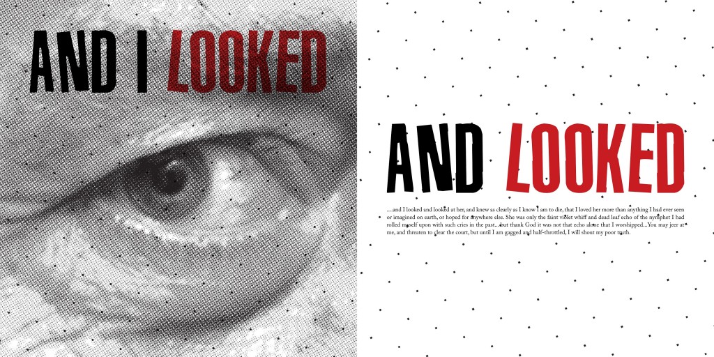
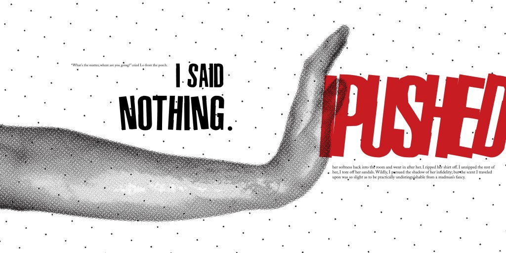
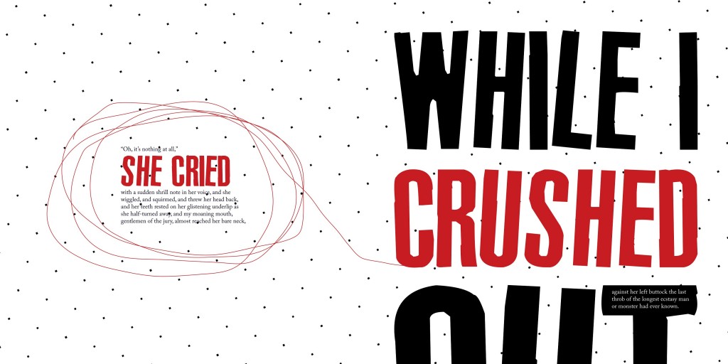
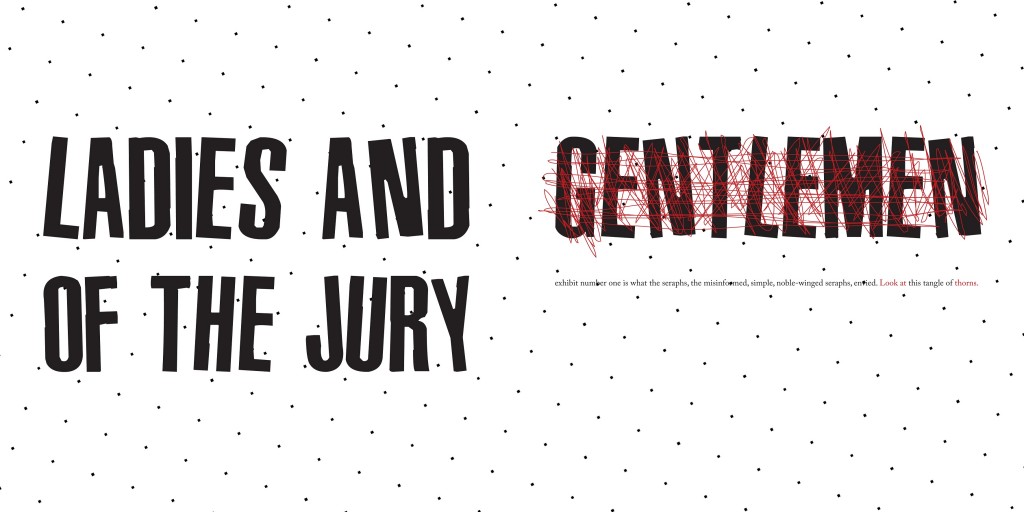
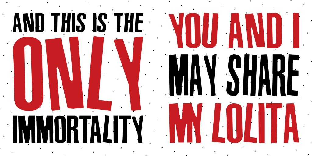
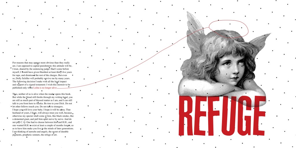
Sanja Planinic, a graphic design student at the Academy of Fine Arts Sarajevo sent me a link to a project she had recently completed for a book design class. The book was Lolita, and the resulting red, white and black images, reminiscent both of Barbara Kruger’s critiques of power and sexism as well as constructivist photo-montages, act as potent commentary on the story. The key lies in understanding that the black text represents Humbert while the red text and “the little red childlike interventions” act as Lolita’s gloss on Humbert’s text as well her small yet persistent bid for autonomy and her attempt to carve out her own identity amidst the crushing authority of Humbert’s words.

I found Planinic’s text selections quite intriguing. Be sure to click on the images above to appreciate them full size.

vladimir nabokov lolita (with stalin and lenin), vagrich bakhchanyan

May 3rd, 2012

Before today I had not heard of the Armenian-Ukrainian artist Vagrich Bakhchanyan, but a link to an article by Karin D. B. about The Lolita Project on Sub25, the newly minted Romanian arts and culture site (whose purpose is the promotion of young Romanian artists) shows this image first and foremost. It’s one of a pair of large oil paintings of Stalin and Lenin that was auctioned by Sotheby’s back in 2010 (an earlier collage is shown below). Bakhchanyan was part of the anti-Soviet and anti-propaganda Sots Art movement in Moscow in the early 1970s before moving to New York  in 1975. He died in 2009.

bollingen: an adventure in collecting the past, william mcguire

March 9th, 2012

What was perhaps the most extraordinary publishing venture of the last century was inaugurated in 1943 by Mary Conover Mellon, the 39 year old wife of philanthropist Paul Mellon (who, along with his sister and two cousins for a period comprised half of the eight richest people in the country).

The catalyst for this illustrious enterprise was a five-part seminar conducted by psychiatrist C. G. Jung that the Mellons attended in New York in 1937. What began then as an already ambitious project by Mary to publish the collected works of Jung in English translation exploded into a remarkable publishing program of hundreds of titles that included works by Joseph Campbell (The Hero with a Thousand Faces), Mircea Eliade (The Myth of the Eternal Return), Heinrich Zimmer (The King and the Corpse), Marie-Louise von Franz (Aurora Consurgens), and Jaroslav Pelikan (Imago Dei: The Byzantine Apologia for Icons) to name a few, as well as critical translations of new and classic works: the collected works of Paul Valery, Pushkin’s Eugene Onegin translated by Vladimir Nabokov and The I Ching translated by Richard Wilhelm. The Bollingen Foundation (named for the village where  Jung built his retreat the “Tower”)  sponsored archaeological expeditions, established research fellowships, initiated a poetry prize and a lecture series and in general supported the work and livelihood of a startling number of people including Olga Fröbe-Kapteyn, who organized the annual Jung-related Eranos lectures at her home in Anscona, Switzerland and Natacha Rambova, the silent film costume and set designer (and wife of Rudolph Valentino) turned Egyptologist. The story of the Bollingen Foundation is full of fascinating tales and eccentric people, behind which is glimpsed only rarely the elusive figure of the philanthropist with a nearly limitless bank account whose major gifts to institutions include the Yale Center for British Art, and the East Wing of the National Gallery of Art.

My introduction to the Bollingen Series came in 1984 during my freshman year at St. John’s College when I purchased a copy of The Collected Dialogues of Plato that absolutely radiated gravitas through its austere olive green jacket. Those first year students flush with cash were also able to buy another Bollingen book, the newly published Oxford Translation of Aristotle with its brilliant shiny cover somewhere between French ultramarine and cobalt blue (I remember it costing an exorbitant $60).  The rest of us had to make do with Random House’s rather tweedy old Basic Works of Aristotle. (To be sure, though, the famous series at the St. John’s bookstore was unequivocally the fusty diminutive volumes of The Loeb Classical Library, specifically the Greek texts bound in green linen with gold embossing and Irish green jackets — two years of Greek was required, but no Latin. I still have the two Loebs:  Sophocles’ Oedipus Tyrranus and Sextus  Empiricus’ Outlines of Pyrrhonism).  My junior year I acquired my third and last program-related Bollingen: Charles S. Singleton’s translation of Dante’s Commedia.

davis carr

December 30th, 2011

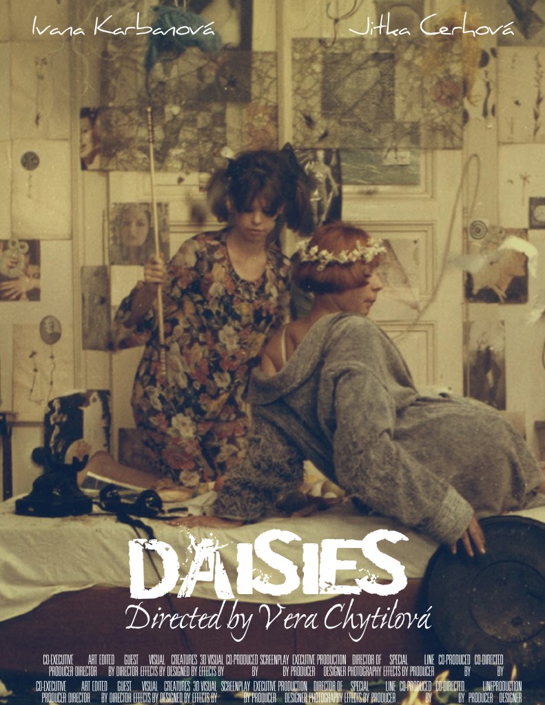
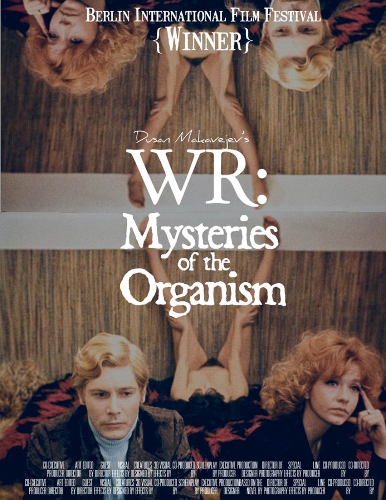
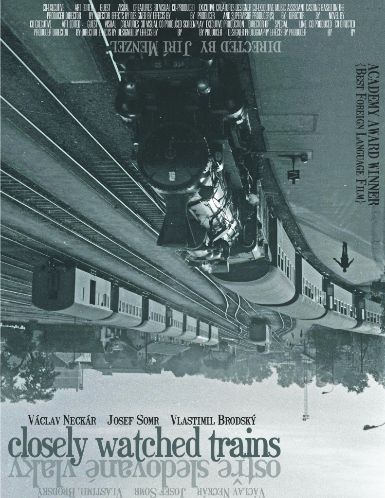
My colleague Yuri Leving recently taught a course entitled EAST EUROPEAN CINEMA: WAR, LOVE, AND REVOLUTIONS. Among the many wonderful (and seminal) films viewed and analyzed were Jiri Menzel’s Closely Watched Trains (Czechoslovakia, 1966), Dusan Makavejev’s WR: Mysteries of the Organism (Yugoslavia, 1971), Vera Chytilova’s Daisies (Czechoslovakia, 1967), and Elmar Klos’ and Jan Kadar’s The Shop on Main Street (Czechoslovakia, 1966). One student, Davis Carr, created poster designs for several of the films featured in the syllabus. Yuri was eager to share these with me and I, in turn, am delighted to share them here. I think they compare favorably to current Criterion and Second Run offerings.

You can read Carr’s commentary on these posters here and view the complete PowerPoint presentation that includes several additional posters.

keenan!

August 2nd, 2011

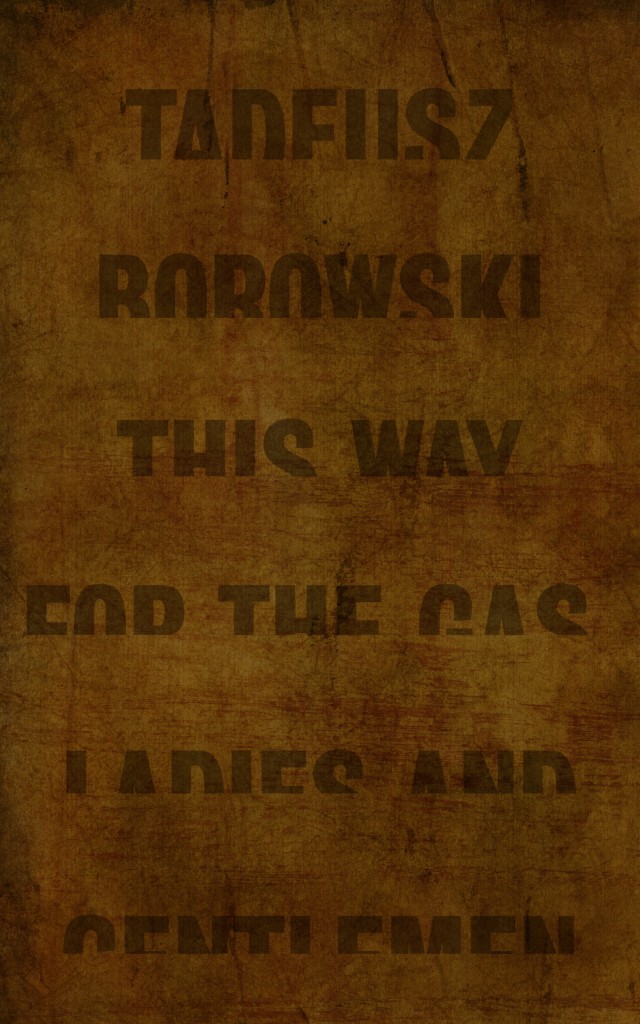
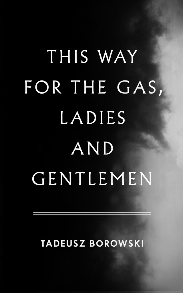
Hard to beat Jamie Keenan‘s cover for This Way for the Gas, Ladies and Gentlemen.

From my essay:

“Several nearly monochromatic covers reveal unexpected eloquence by using obscured, distorted and disappearing text to great effect. Jamie Keenan’s truncated words that appear to be in the process of sinking into a heavily textured background suggest the methodical erasure of countless lives that vanished into nothingness.”

suzene ang, winner contest no. 7

July 31st, 2011

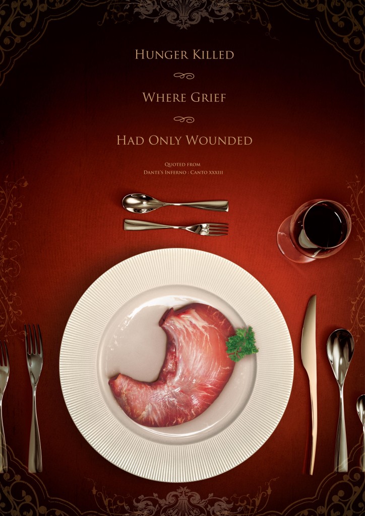
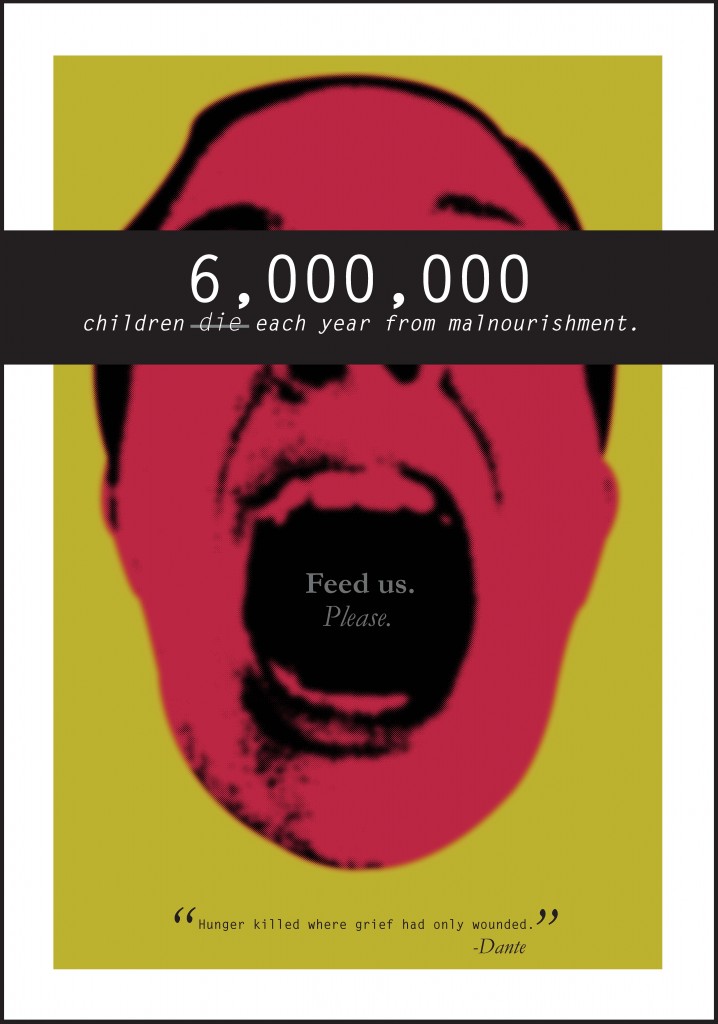
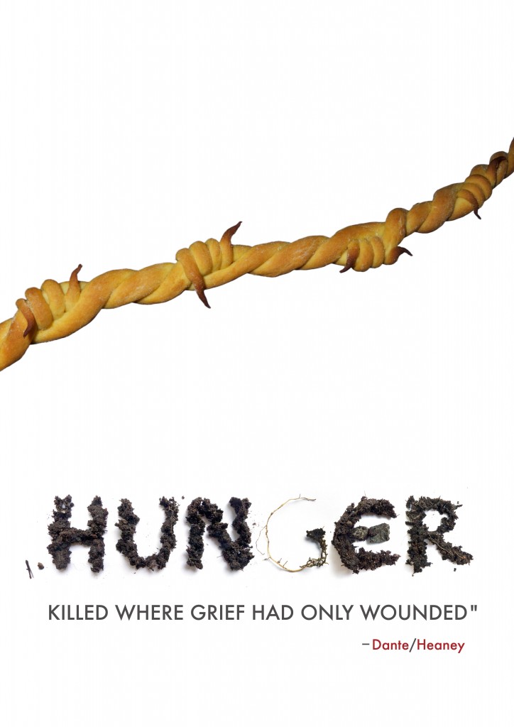
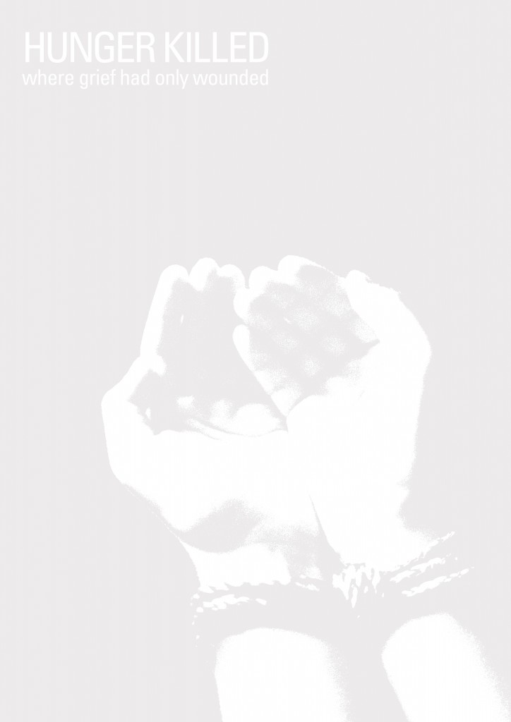
It was a rather dissapointing turnout for the latest contest, both in terms of number of submissions (58) and overall quality. It was perhaps too difficult a task to integrate the Dante/Heaney quote with all of its ambiguity and complexity with the notion of a global hunger campaign. In many ways, the two notions were at odds. Marco and I discussed not awarding a prize at all. Still, there were several bright spots and we were in agreement on the five best entries, none of which were excellent, but which still seemed measurably better than the rest. Moreover, we agreed that Suzene Ang’s entry was just that much better than the other four. We were also aware that since Suzene was the winner of a previous contest as well as being honorably mentioned in others that perhaps there would be a sense of impropriety or unfairness in our decision. We decided, though, that no one should be penalized for submitting high-quality entries to several contests and, in the end, we decided to award Suzene one-half of the prize money and to donate the remaining half to Save the Children, not because she has been a past winner, but because we felt that no one submitted an entry that succeeded on all counts.

With that being said, we are pleased to also show the four runners-up. From top to bottom shown below are Jessie Kroeger, Eva Toth, Mitoui Razvan and Ryan Igarashi.

david gee

July 20th, 2011

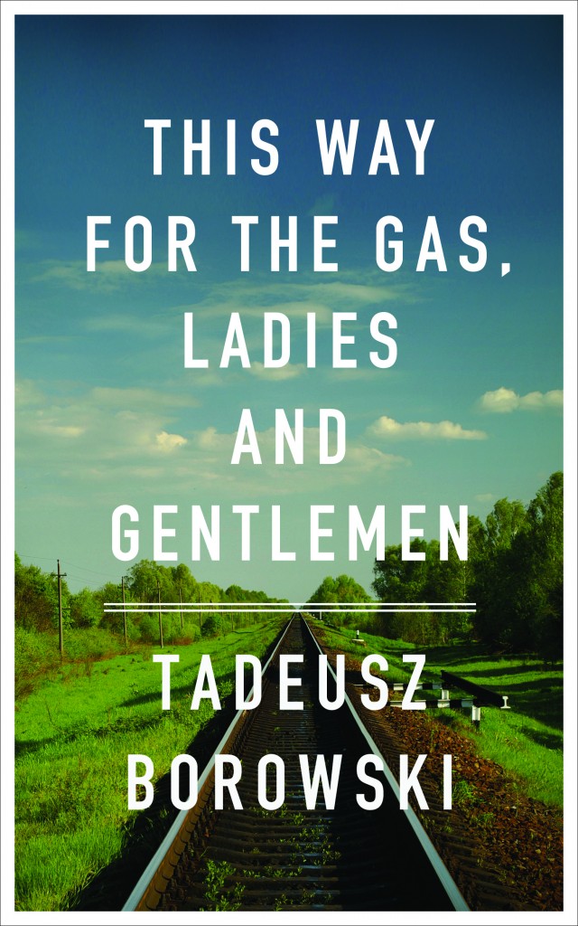
I love David Gee‘s cover for This Way for the Gas, Ladies and Gentlemen.

From my essay:

“In one cover, Peter Chmela uses the device of a documentary-like image, a ‘realistic’ grainy and overexposed black and white photograph, its authority further reinforced by the use of a font modelled on jumpy mid-20th century typewriter text. The typical response to such indicators is automatic: it is seen as objective, matter of fact, historical; in other words, a cover befitting the gravity of the subject, a methodology commonly used when the imprimatur of verity is needed or sought (take for example, the use of black and white photography in Steven Spielberg’s 1993 film Schindler’s List, a half century after the advent of Technicolor’s three-strip process).

David Gee on the other hand, quite consciously used no such indicators, explaining that the idea for his cover

came after noticing that there is a common visual language for books of this nature: black and white imagery, black letter text, grungy effects; all employed to do most of the work for the reader. I used a colour photograph to contemporize the cover and emphasize that these events did not occur in black and white. They happened on beautiful days as often as they did on overcast, grey, gloomy days, and this only serves to deepen the horror.


Gee also took pains to clarify his use of the particularly legible font:

The type itself is set in DIN which was adopted by the German government in the late 1930s.[i] It was borne of a need and desire for ‘standardization and simplification’ (conveniently, Germans could read the new pan-European road and rail signs from their tanks) but the fact that these two words had greater and parallel ideological implications makes it all the more chilling.

Upon request Gee agreed to share his initial idea whose sombre black and white cover and funereal font support his argument above. Beautiful, stately and perhaps appropriate in any other context, the austere design is elegiac, verging on the heroic, and vaguely fascistic. Gee obviously realized it was quite wrong for this ‘anti-redemptory’ collection of stories and instead chose the direction above.”


[i] The German standards organization Deutsches Institut für Normung adopted the font, known as DIN 1451 in 1936.

lolita: the story of a cover girl, john bertram & yuri leving, eds.

May 17th, 2011

0220_Lolita_A

Readers of Venus febriculosa will know that in 2009 after discovering Covering Lolita, Dieter Zimmer’s online collection of covers, I sponsored a book cover competition for a new cover for Lolita. In all, 105 entrants from 34 countries submitted a total of 155 entries. Subsequently, I was approached by Yuri Leving, editor of the Nabokov Online Journal about writing an essay on the experience. I readily agreed, and the following year my paper was published. It occurred to me that this is a subject with much more to explore and decided it would be worth taking the project one step further. I contacted book designers, artists, design critics, and Nabokov scholars about participating in an interdisciplinary work exploring the issues uncovered by Covering Lolita and the Venus febriculosa contest. The result is Lolita: The Story of a Cover Girl which contains eighty new covers including a handful of the best covers from the competition along with a dozen essays about Nabokov and design. The forthcoming book will be published by Print Books in August (with the cover you see here by Sulki & Min!). You can see a sampling of some of the covers as well as an interview with me in Recovering Lolita, a wonderful article on Print Magazine’s site! Mary Gaitskill, author of Bad Behavior, is writing the foreword. Pre-order a copy of the book here!

Contributors include:

Stephen Blackwell, Chair, Russian Program, University of Tennessee, Knoxville, and author of The Quill and the Scalpel: Nabokov’s Art and the Worlds of Science

Barbara Bloom, Nabokov-obsessed conceptual artist (Revised EvidenceVera’s Butterflies, The Collections of Barbara Bloom)

Sian Cook, London College of Communication and Teal Triggs, Professor of Graphic Design, Royal College of Art, co-directors of the Women’s Design + Research Unit and designers, with Liz McQuiston, of the Pussy Galore conceptual font

Leland de la Durantaye, Gardner Cowles Associate Professor of English at Harvard and the author of the wonderful Style is Matter: The Moral Art of Vladimir Nabokov

Mary Gaitskill, author of several books, including Two Girls, Fat and Thin, Veronica, and Bad Behavior.

John Gall, art director at Vintage and Anchor Books and designer of the latest cover of Lolita, who acted as resident expert and adviser for the contest.

Yuri Leving, Chair, Department of Russian Studies at Dalhousie University and editor of the Nabokov Online Journal

Ellen Pifer, Professor of English & Comparative Literature at the University of Delaware, former president of the International Vladimir Nabokov Society, and editor of Vladimir Nabokov’s Lolita: A Casebook

Alice Twemlow, Chair and program co-founder, Design Criticism Department, School of Visual Arts and author of What is Graphic Design For?

Duncan White, Co-Editor with Will Normanof Transitional Nabokov

Paul Maliszewski, author of Paperback Nabokov

Dieter E. Zimmer, Author of Wirbelsturm Lolita; A Guide to Nabokov’s Butterflies and Moths; and Nabokov’s Berlin

There are so many incredible designers on board providing new covers including:

Mark Abrams

Keira Alexandra

Geetika Alok

Suzene Ang

April

Helen Armstrong

Aleksander Bak

Rachel Berger

Laura Berglund

Michael Bierut

Kelly Blair

Davis Carr

Sara Cwynar

Matt Dorfman

Johanna Drucker

David Drummond

Aliza Dzik

Vivienne Flesher

John Fulbrook III

Xavi Garcia

David Gee

Elena Giavaldi

Kate Gibb

Walter Green

Elena Grossman

Lyuba Haleva

Kat Hammill

Lauren Harden & Seth Ferris

Margot Harrington

The Heads of State

Jessica Helfand

Jennifer Heuer

Jessica Hische

Karen Hsu

Agata Jakubowska

Daniel Justi

Jamie Keenan

Philip Kelly

Ely Kim

Marina Mills Kitchen

Gregg Kulick

Chin-Yee Lai

Mark Lazenby

Sueh Li Tan

Ellen Lupton

Mary Voorhees Meehan

Mark Melnick

Peter Mendelsund

Debbie Millman

Razvan Mitoiu

Dan Mogford

Oliver Munday

Susan Murphy

Catherine Nippe

Linn Olofsdotter

Ingrid Paulson

David Pearson

Jason Polan

Laurie Rosenwald

Tanya Rubbak

Rumors

Paula Scher

Diane Shaw

Yuko Shimizu

Isaac Tobin

Transfer Studio

Anne Ulku

Jenny Volvovski

Michel Vrana

Jen Wang

Chip Wass

Sam Weber

Adrienne Weiss

Barbara deWilde

Gabriele Wilson

Ben Wiseman

Graham Wood

Henry Sene Yee

Anna Zukowska-Zysko


The format will be similar to This Way, a book edited by Marco Sonzogni based upon Venus febriculosa’s 4th book cover competition for Tadeusz Borowski’s This Way for the Gas, Ladies and Gentlemen.

Please check back soon for more information!